TrustedHousesitters is a platform connecting pet owners with pet sitters. For an annual fee, sitters stay free in homes worldwide, caring for pets while owners travel, offering a win-win for affordable travel and pet care.
The problem
For half my time at TrustedHousesitters, I worked with the Growth Alliance, focusing on increasing the membership base. The number of pet sitters joining the platform was healthy, but the membership base was becoming imbalanced on the supply side; not enough pet owners AKA “Pet Parents” were joining the platform. How could we achieve the outcome of more customers buying an annual Pet Parent Membership?
This was a research-driven initiative, uncovering potential customers' problems and concerns and discovering opportunities and growth levers to address them.
How could we achieve the outcome of more customers buying an annual Pet Parent Membership?
Survey insights and affinity mapping
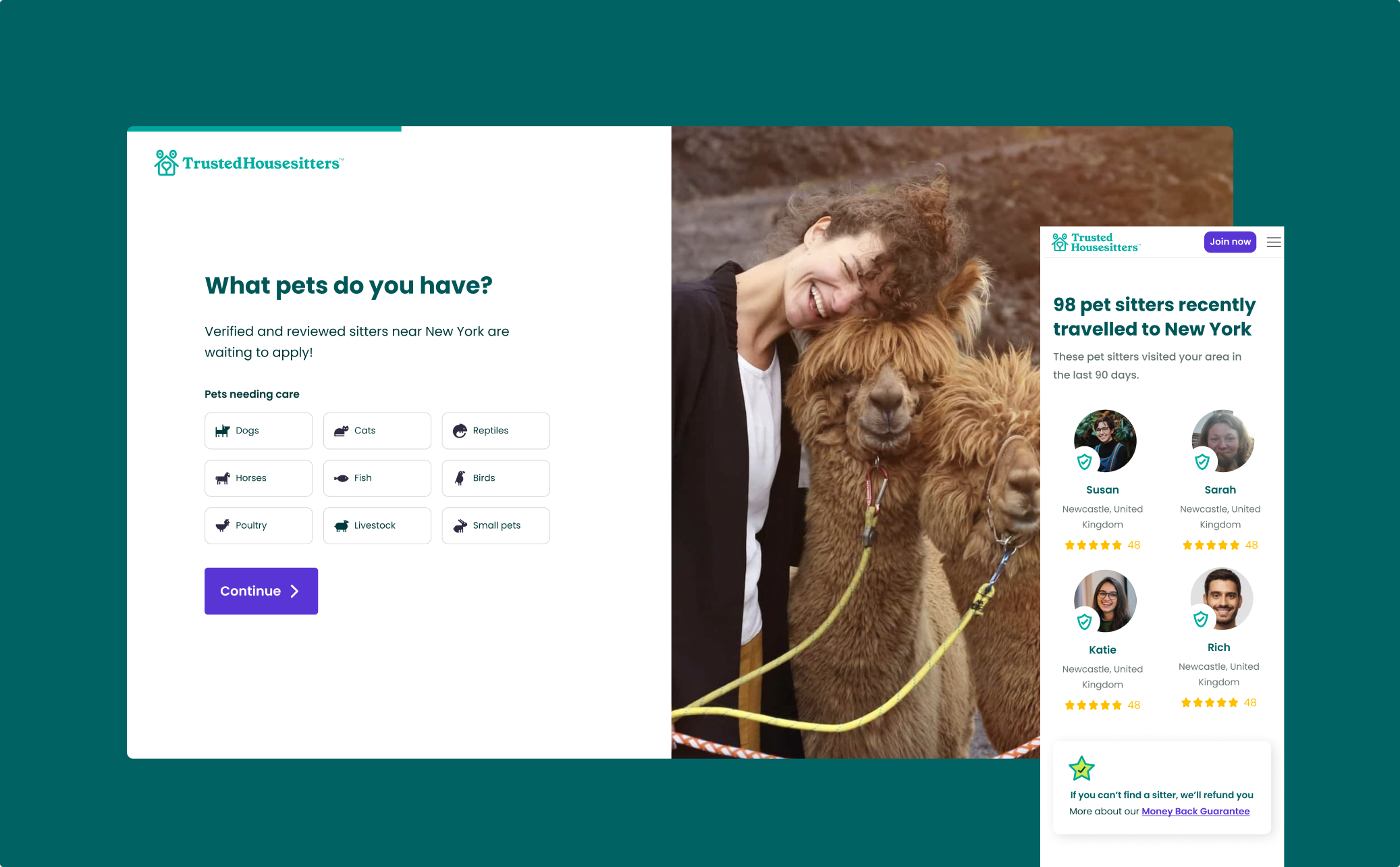
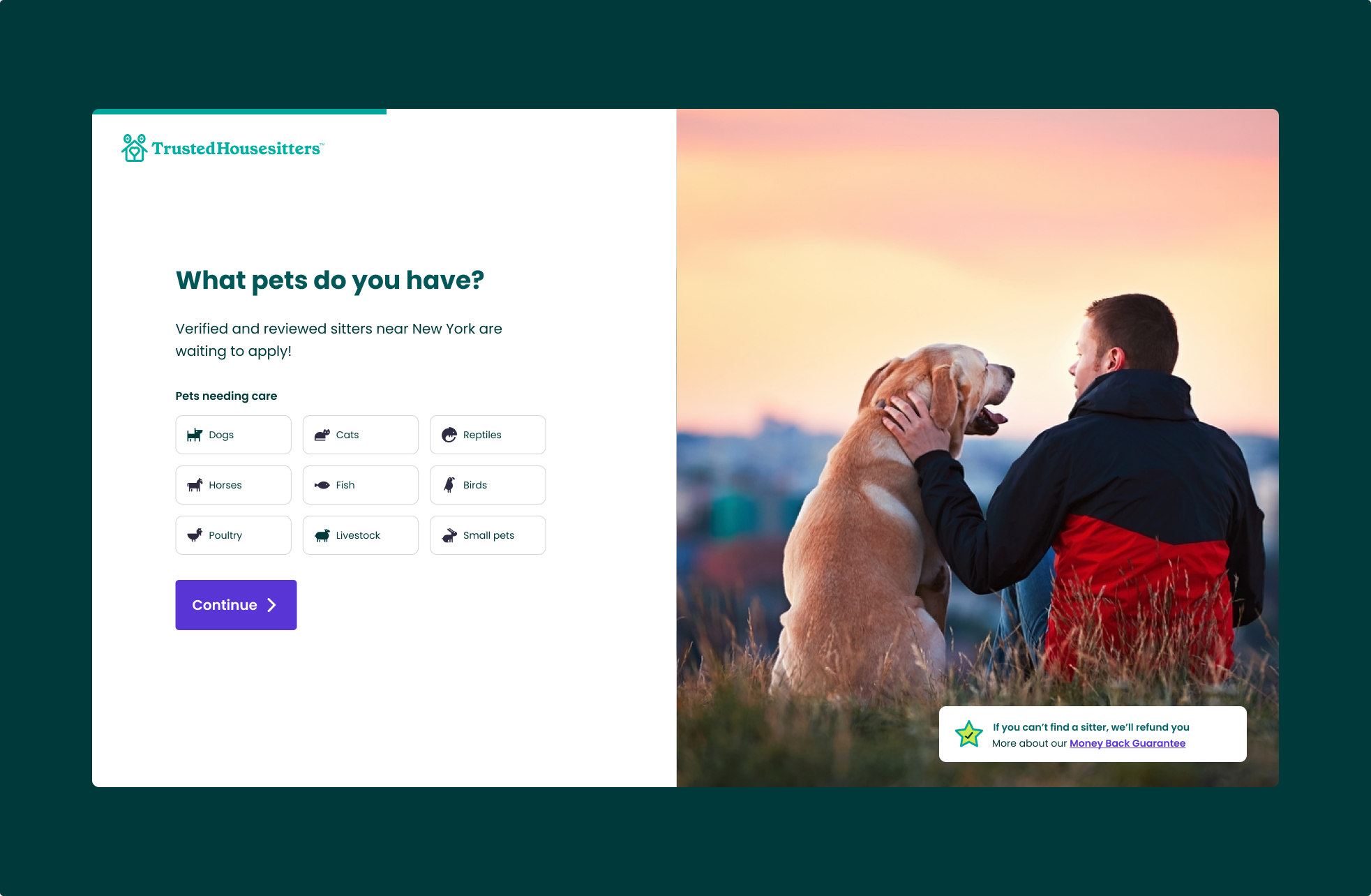
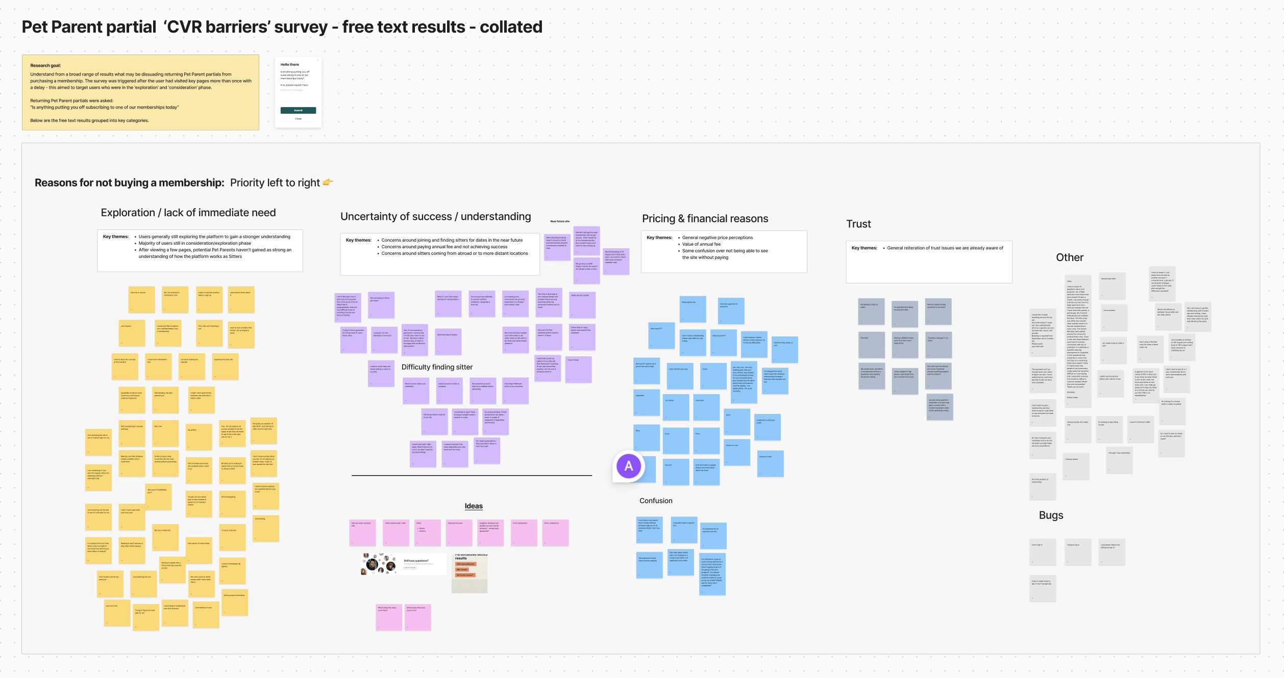
A popup survey was launched on the “Find a sitter” page, a key page in the flow for new Pet Parents. This was targeted at users who had visited the site multiple times, attempting to target high-intent users.
Is anything putting you off buying a membership today?
The survey was free text and asked users “Is anything putting you off buying a membership today?”. The results were then imported into Figma where I completed an Affinity Mapping process to bucket the responses into key groups, which can be viewed below. The main reasons discovered putting users off buying a membership were:
- Lack of immediate need
- Uncertainty of success and a lack of understanding
- Pricing and financial reasons
- Trust
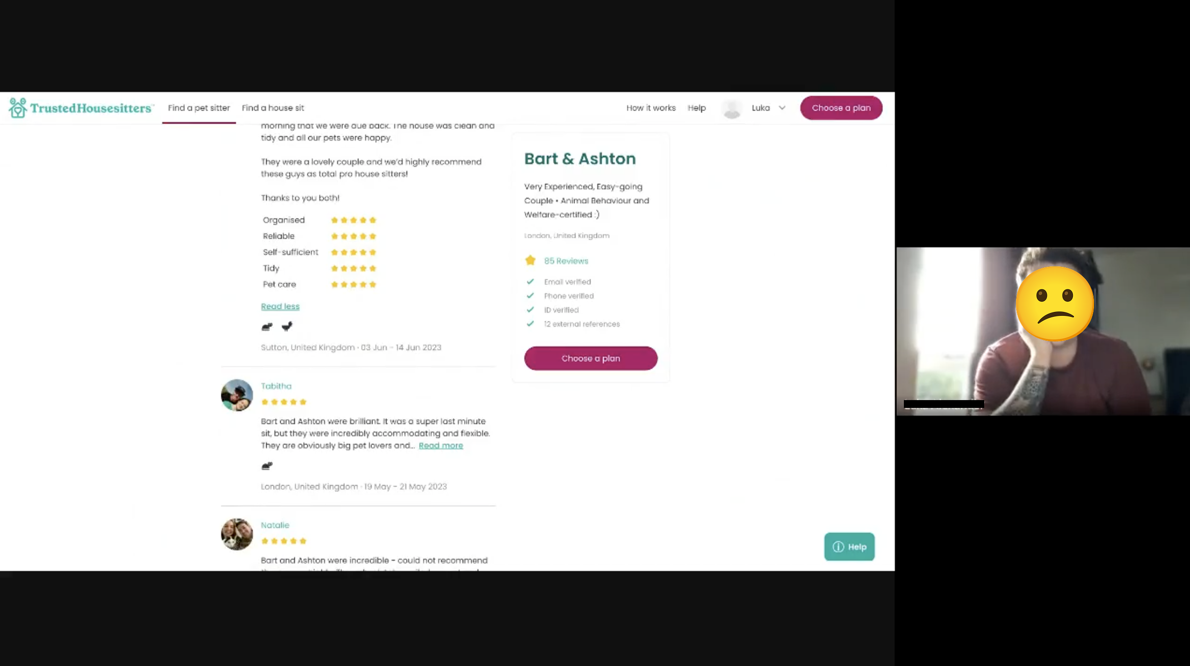
User testing
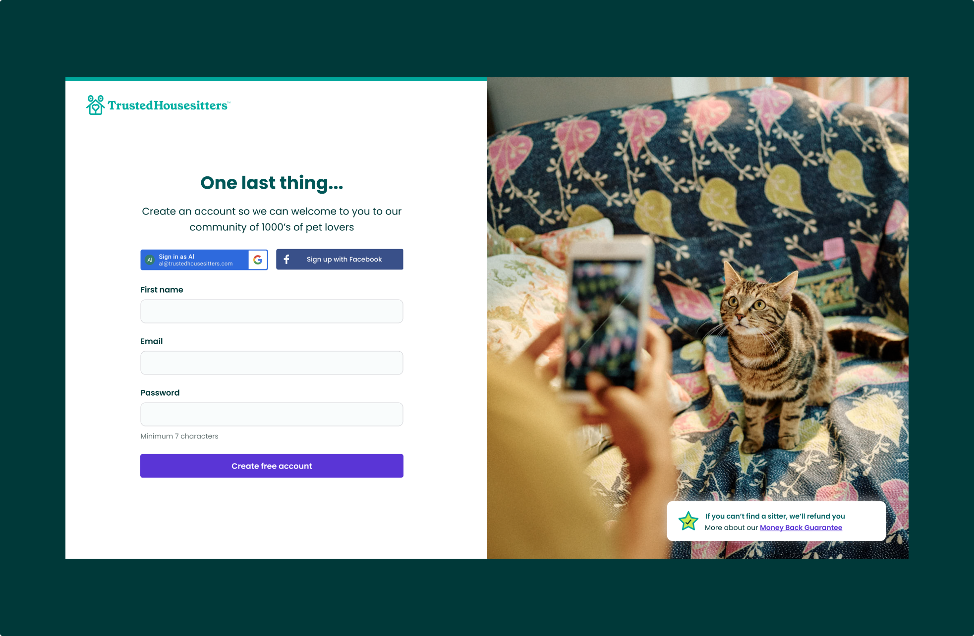
To compound the results from the survey I ran ten moderated testing sessions. We tested the entire flow for potential Pet Parent customers from initially finding out about the company through to choosing a plan on the pricing page.
I don’t understand, I thought I’d have to invite pet sitters.
No, that’s not what I expected at all.
Having people apply sounds far easier!
We uncovered a critical misunderstanding in the user flow: potential customers didn’t understand how the platform worked. All participants assumed the platform was invite-based, a mental model most likely inherited from how most other pet-sitting platforms work. In reality, pet sits on TrustedHousesitters are application based. Pet Parents create and launch a listing and Pet Sitters apply.
When the actual application experience was explained to participants, the majority said they would prefer this to having to invite pet sitters.
Defining the problem to solve
We could see from the survey a large proportion of potential customers had a lack of understanding of how the platform worked, and this aligned clearly with the experience most test users had.
This gave us a strong signal that tackling this user issue and explaining the value proposition was a strong opportunity area.
We hypothesised that by helping users understand how the platform works, they would be more likely to pay the annual fee and conversion rate would increase.
How to approach the problem
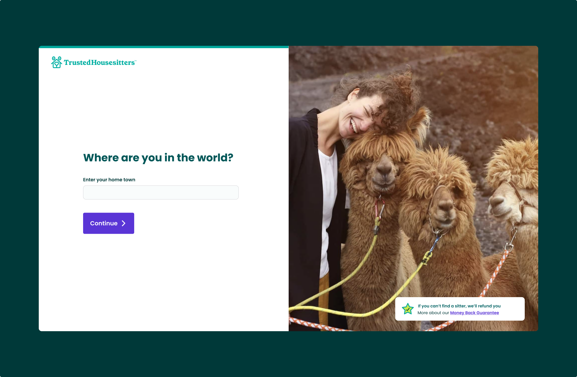
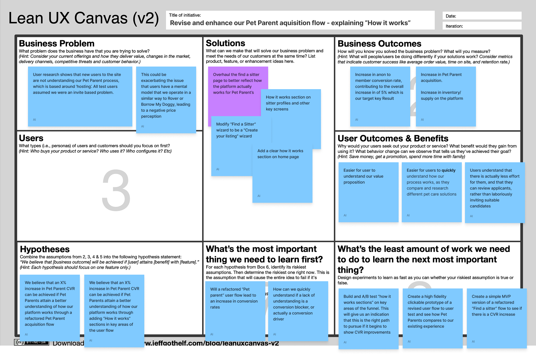
With a direction in place, we then used Jeff Gothelf’s Lean UX Canvas to frame the problem and asses which solution to focus on to tackle the user and business problem. We decided the most impactful area to work on was the main “Find a sitter” page, which is the key page on the prospective customer journey for Pet Parents and where most of the confusion arose from during user testing.
Team ideation workshop
To start the ideation process, I conducted a crazy 8’s sketching session with the wider product team. As everyone in the team had deep knowledge of the business and user problems and a wealth of data and research insights, this was a really valuable way of incorporating everyone’s insights into the process.
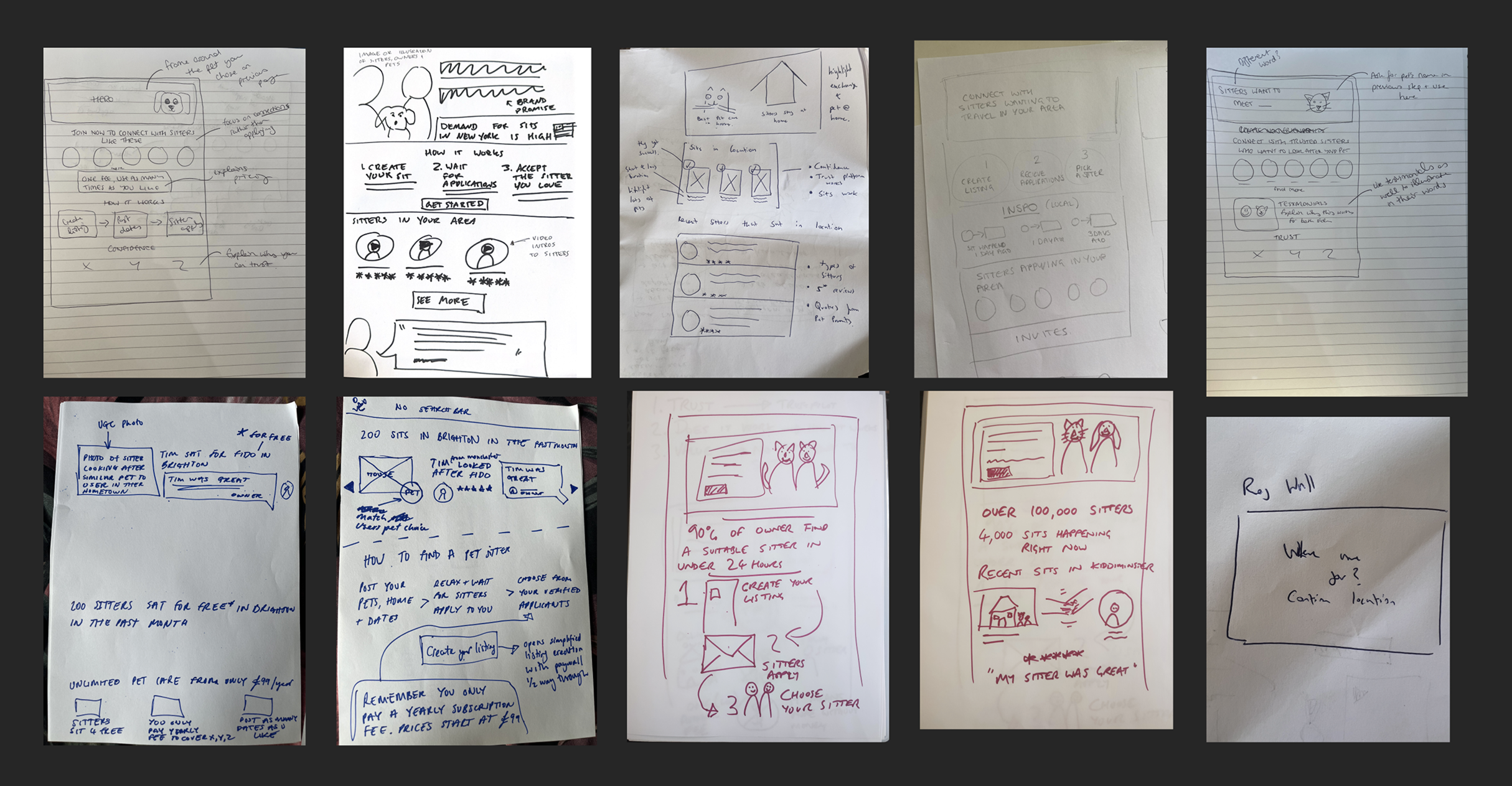
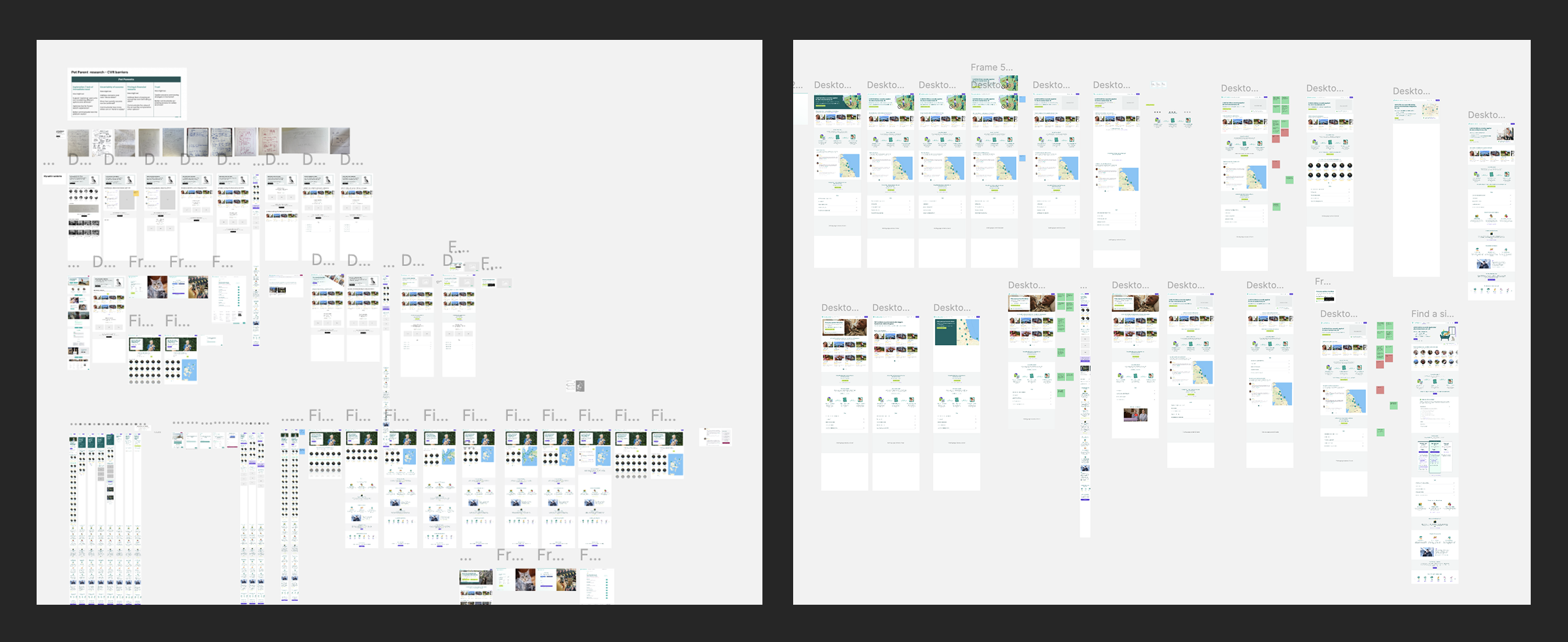
Figma mid fidelity ideation
Building off everyone’s ideas in the workshop, I cast the net much wider and rapid prototyped lots of ideas in Figma.
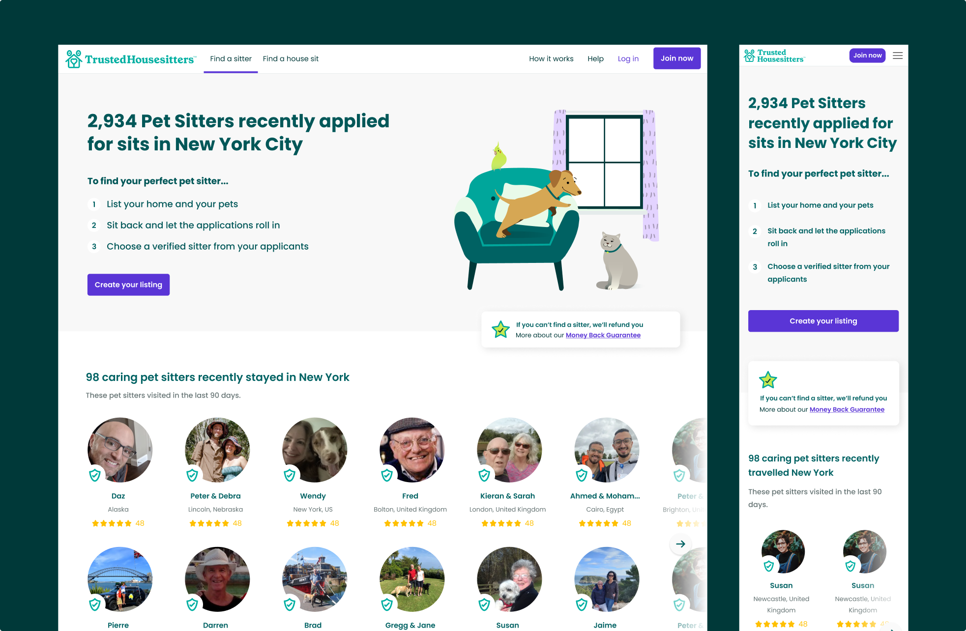
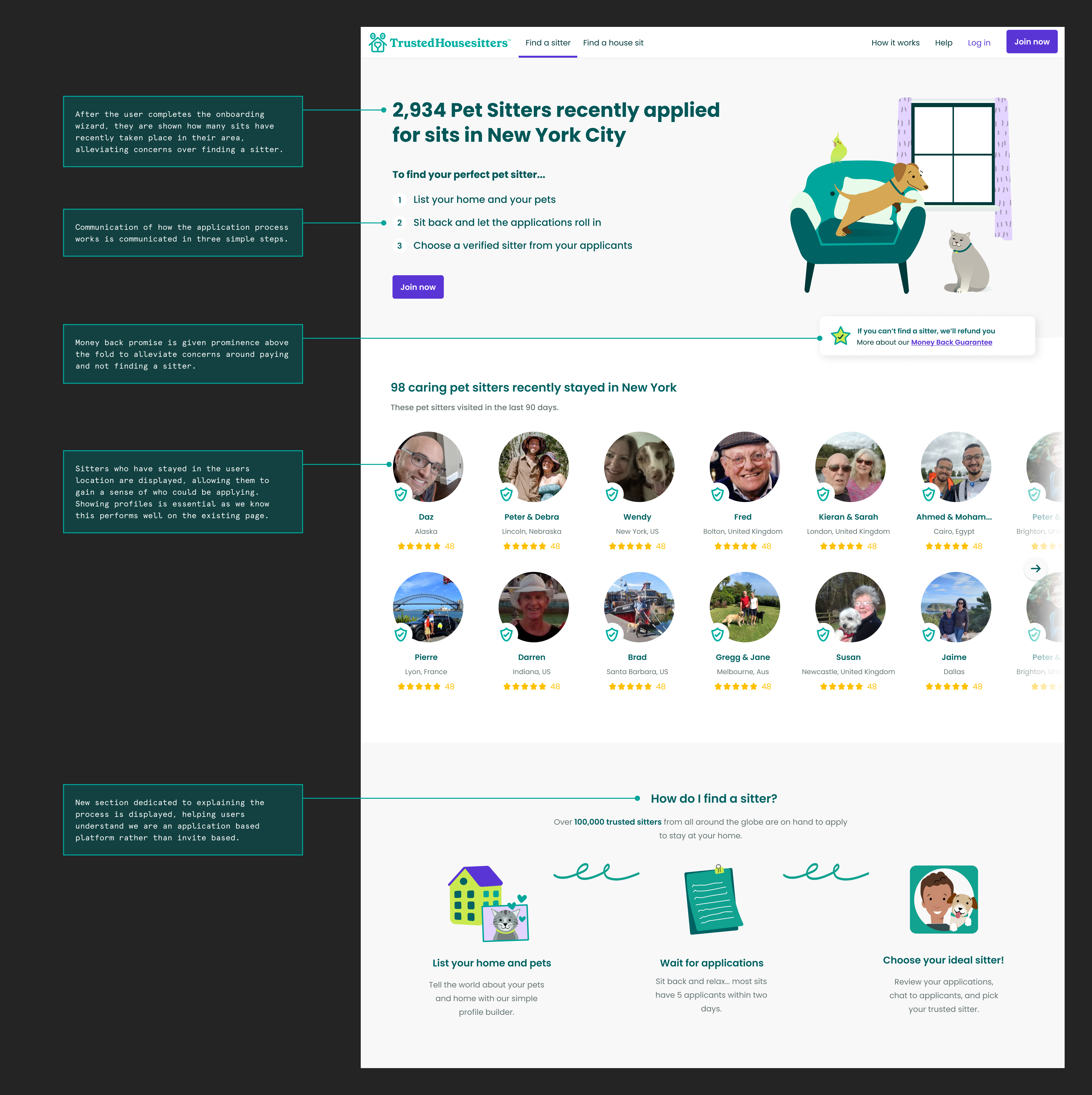
As mentioned, we discovered that a key issue with the existing Find a Sitter page was that users had adopted the mental model that we were an invite based platform. So I began explored how we could redesign the page to show how the platform actually works: by creating a listing and waiting for applications.
We learnt from the user testing that having sitter profiles prominent on the page helped build trust, participants spent quite a bit of time checking out profiles as well as the pages content. This was backed up when checking Amplitude data, on average most new users would view 6 Sitter profiles before going on to choose a membership plan and purchasing. Therefore this aspect of the page would be taken into the redesign
Final design to test
The redesigned page focuses on showing how many sitters applied for sits in the users home town rather than how many sitters are from their home town. We hypothesised that by showing users how popular their location is, their concerns about finding a sitter would be alleviated and they could buy a membership.
We ran five short unmoderated tests in Usertesting.com intending to see whether customers would understand that we were showing how many sitters were interested in their location, as well as looking out for any other usability issues. These tests didn’t lead to many major changes.
A/B testing
The engineering team built the page and I worked with the Data Analyst to plan what data we wished to track on the page. We made sure to add tracking events to the FAQ section so we could see how well we were addressing user's concerns. The test ran for five weeks to reach statistical significance.
Results & conclusion
- 14% Increase in desktop conversion
- 2% Decrease in mobile conversion
- 2% overall conversion rate increase
The increase in desktop conversion was a great success and is a strong indicator that our hypothesis of properly clarifying the platform's mechanics was correct. However, with significant mobile traffic and a negative test on that device size, the overall conversion rate was modest.
We believe that the decrease in mobile conversion is because the fold section of the page is quite large, pushing the profiles (which we know perform well) too far down the page. The next iteration at the time of writing is to make amendments to the fold section so there is a visible section with profiles visible on the page.
Although the test overall had modest results, the fact that the page tested positively on desktop is a strong indicator that this can be achieved on mobile too, leading to a major increase in conversion.
We also gained invaluable research insights and a strong strategy to continue membership growth.
This was the first test in a series of iterations and A/B tests across the new Pet Parent journey which eventually achieved a 12% increase in new member conversion rate.
Next project
Boosting successful listings launched by 12% at Flippa