Background and problem overview
TrustedHousesitters is a platform connecting pet owners with pet sitters. For an annual fee, sitters stay free in homes worldwide, caring for pets while owners travel, offering a win-win for affordable travel and pet care.
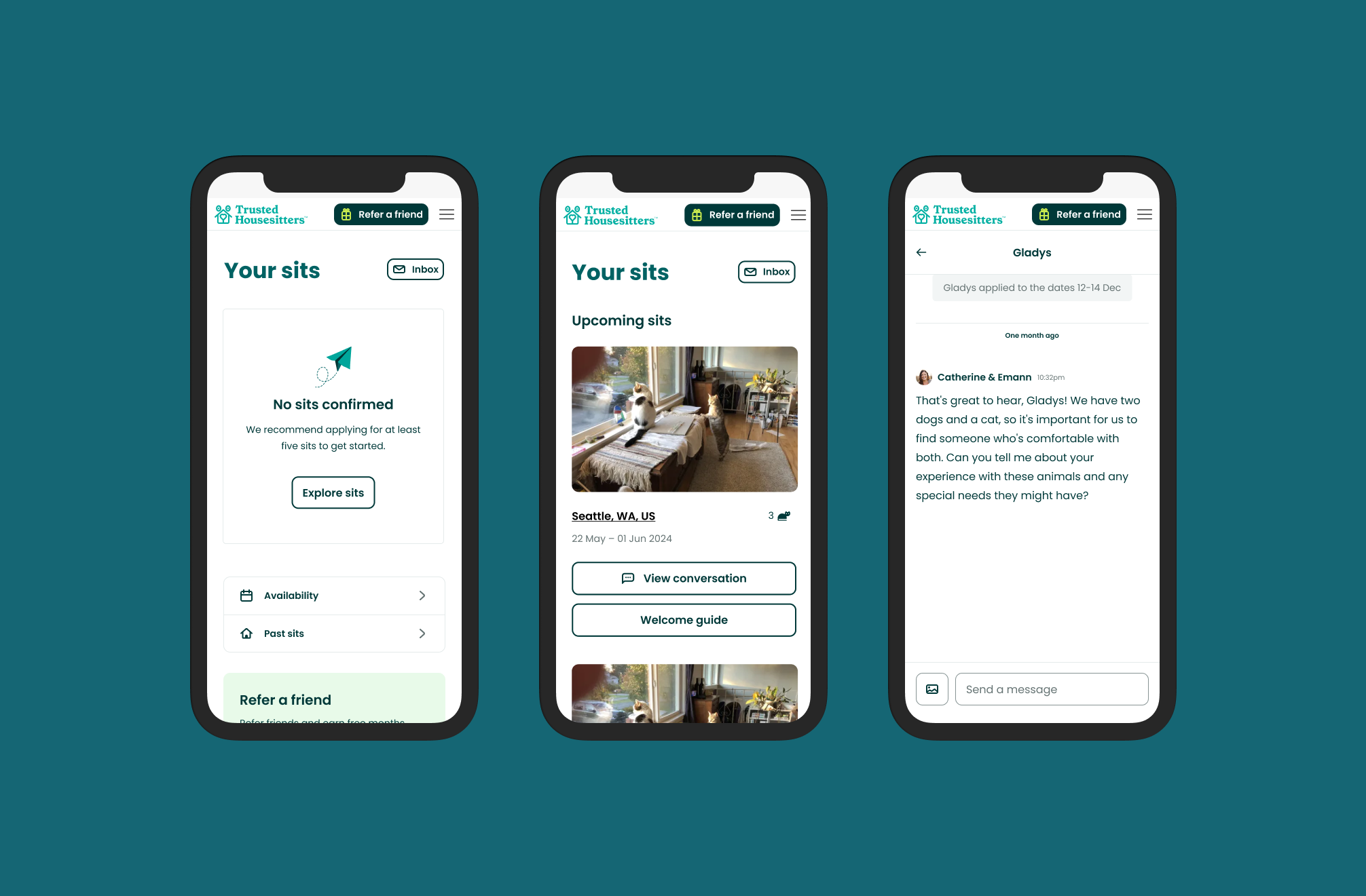
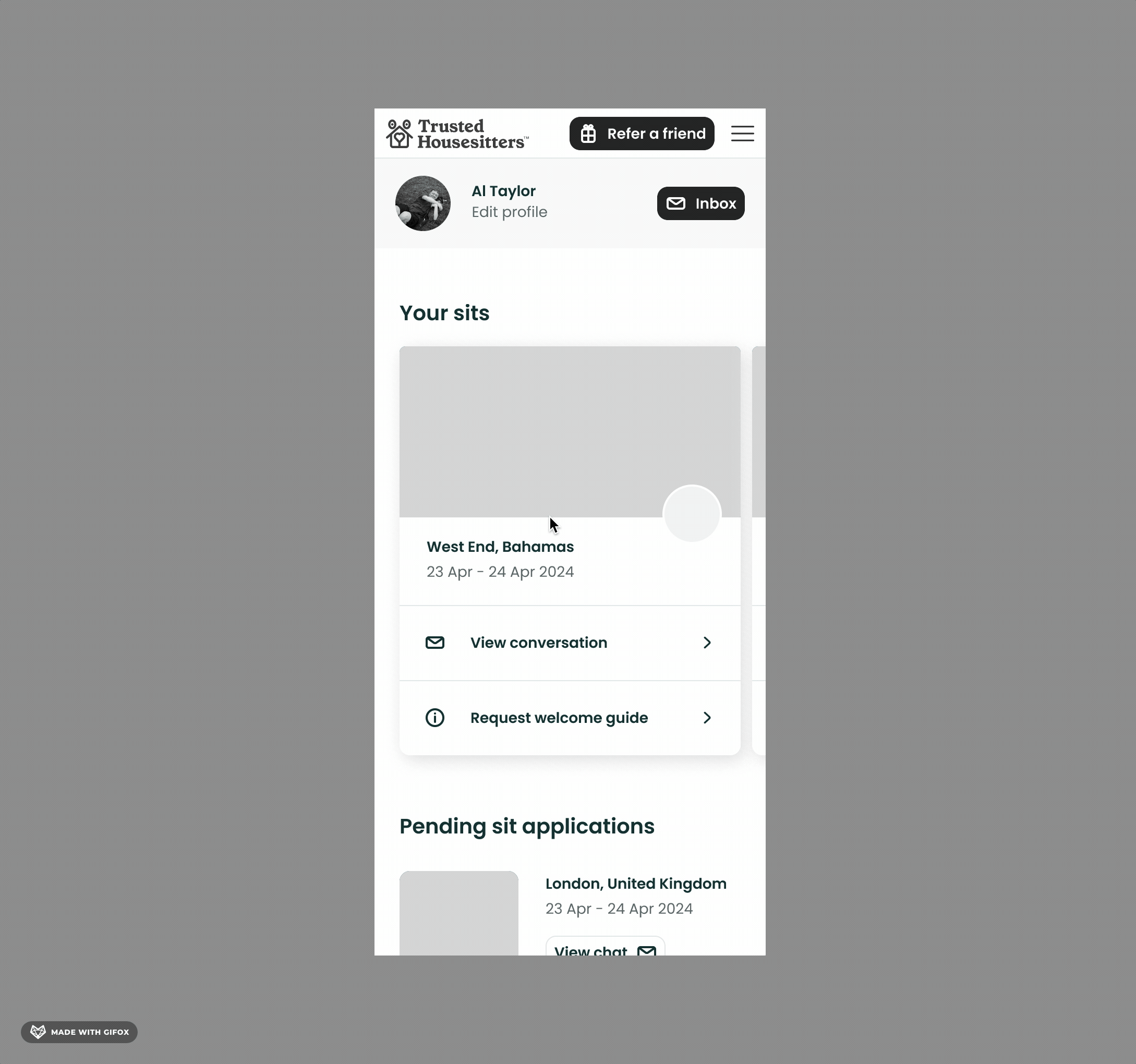
The dashboard is the central point for pet sitters using the platform. It allows them to see all relevant information for Activation (profile completion & verification) and subsequently core pet sitting information and actions around upcoming sits.
The dashboard allows Sitters to complete actions such as:
- Completing verification
- Completing their profile
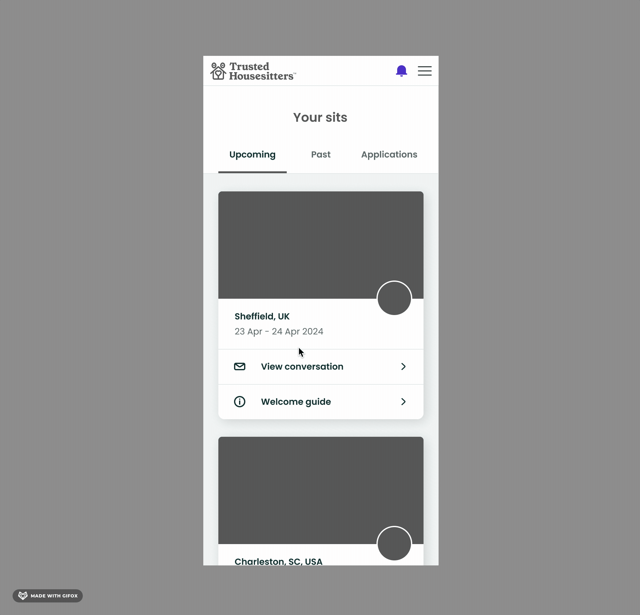
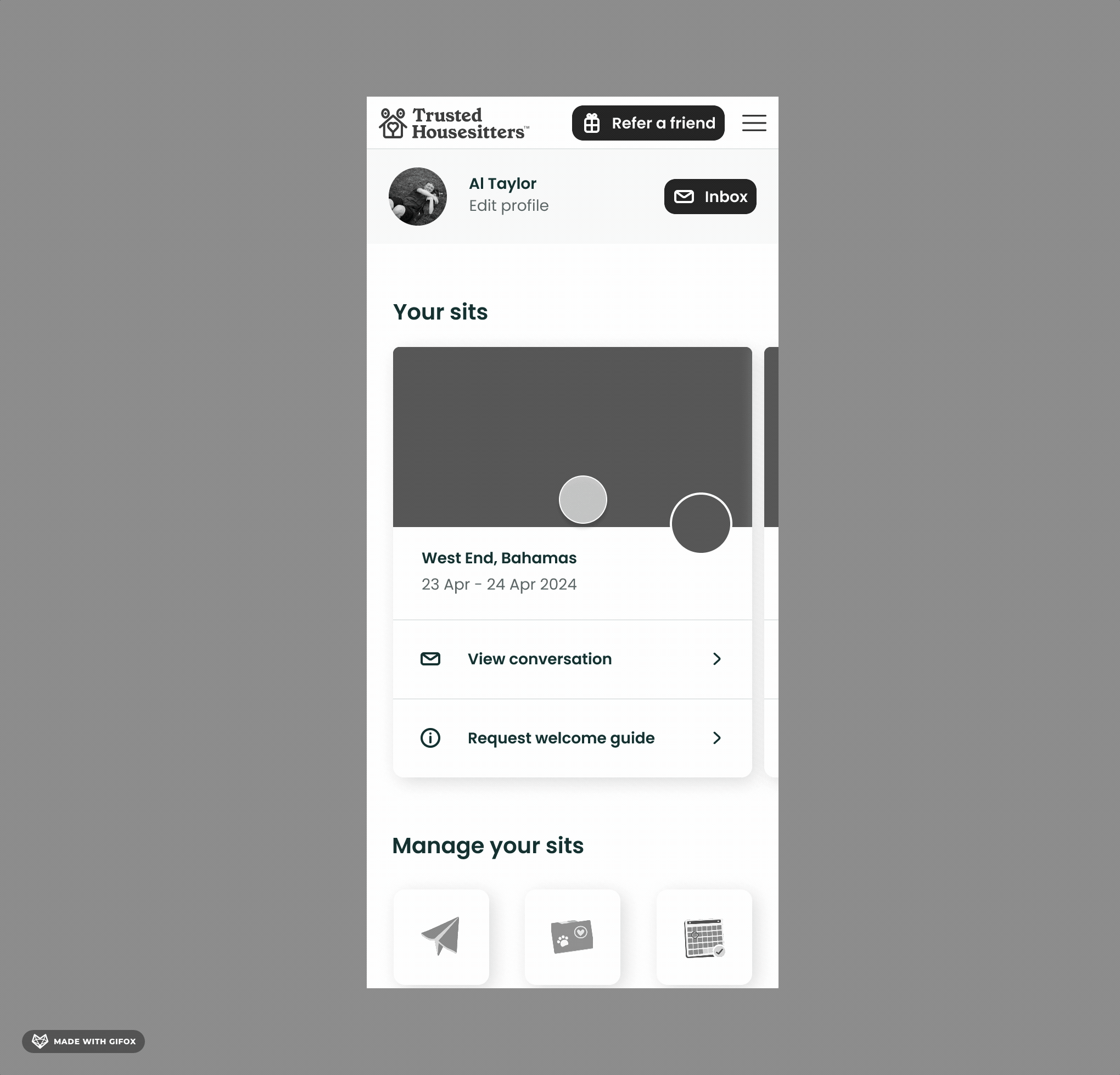
- Managing upcoming sits
- Checking for new messages
- Viewing invites
- Managing their availability
- Accessing Welcome Guides and other key information
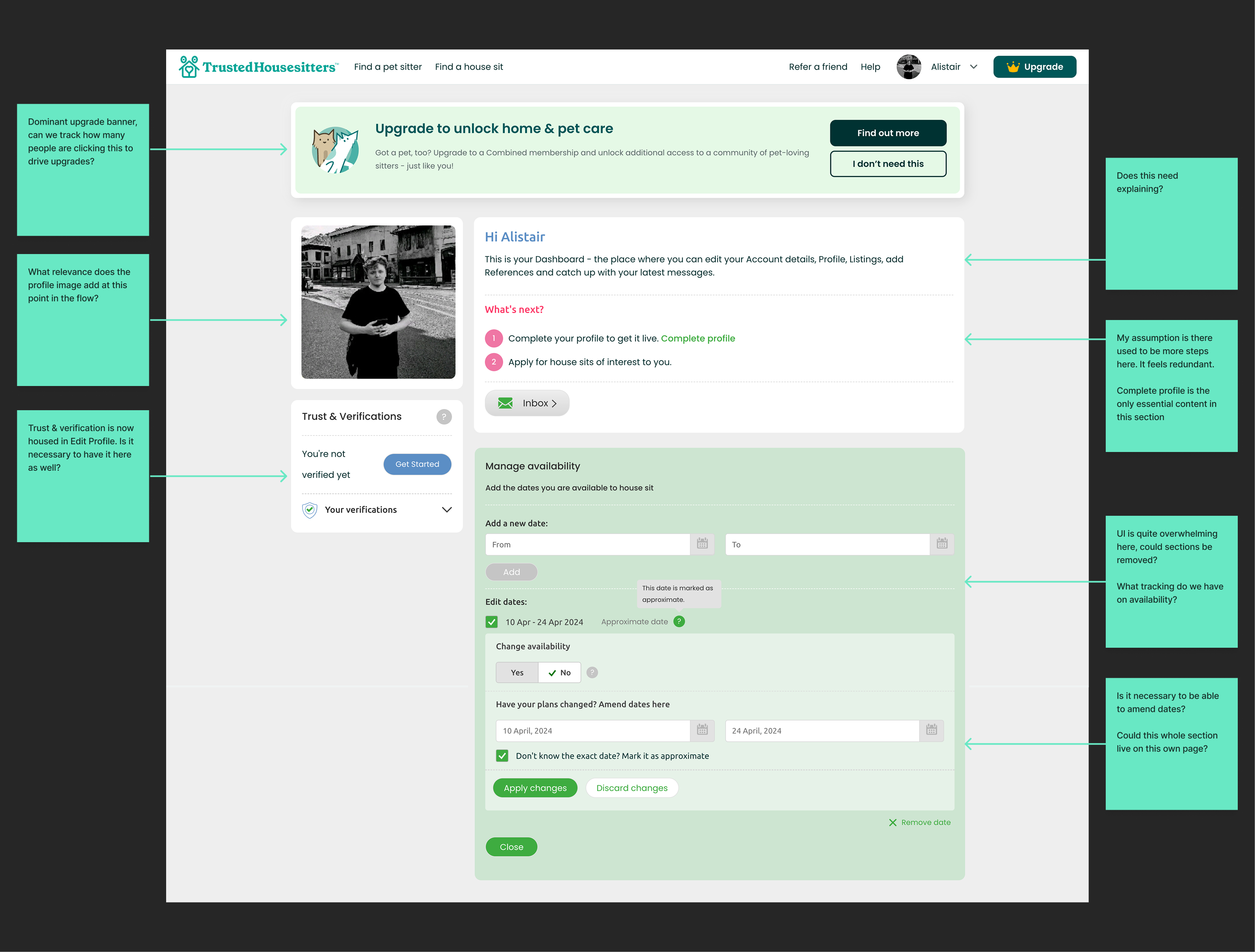
The existing dashboard was built on an outdated code base, making it difficult to maintain and scale. Years of iterative changes had resulted in a cluttered and disorganized experience, with redundant functionality and poor information hierarchy. In short: it was hard to find vital, important content.
1. Reviewing existing designs
I kicked off with a deep dive of all current screens in all of the various user states e.g. newly registered, unverified, verified with no sits booked. I jotted down notes, ideas and questions to discuss with the team and take into the next phase of the design.
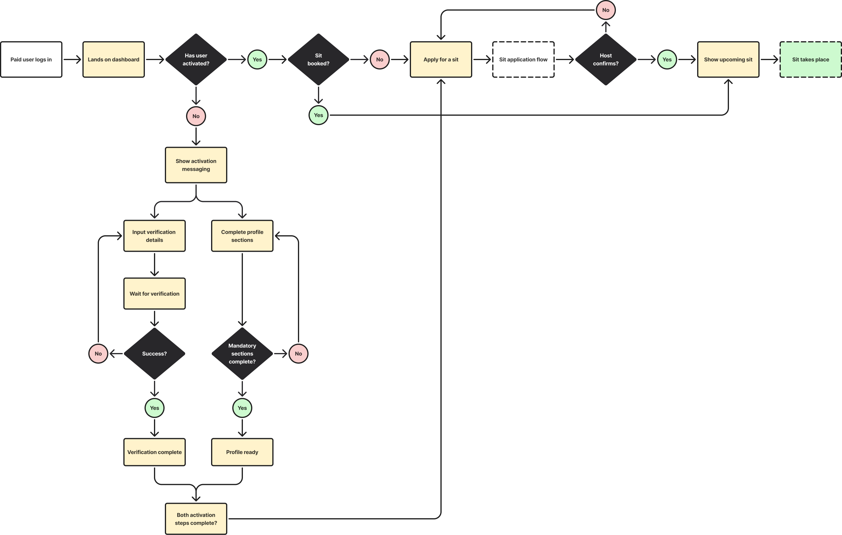
2. Mapping the existing user flow
Although it looks simple on the surface, the dashboard is deceptively complex with many hidden and edge-case states. To ensure no functionality or states were missed in the redesign, I mapped out the user flow by creating a task flow chart, and mapped and documented all various states.
Task flow
The task flow chart below maps out every user task required to activate: getting verified, completing their profile and applying and confirming a sit.
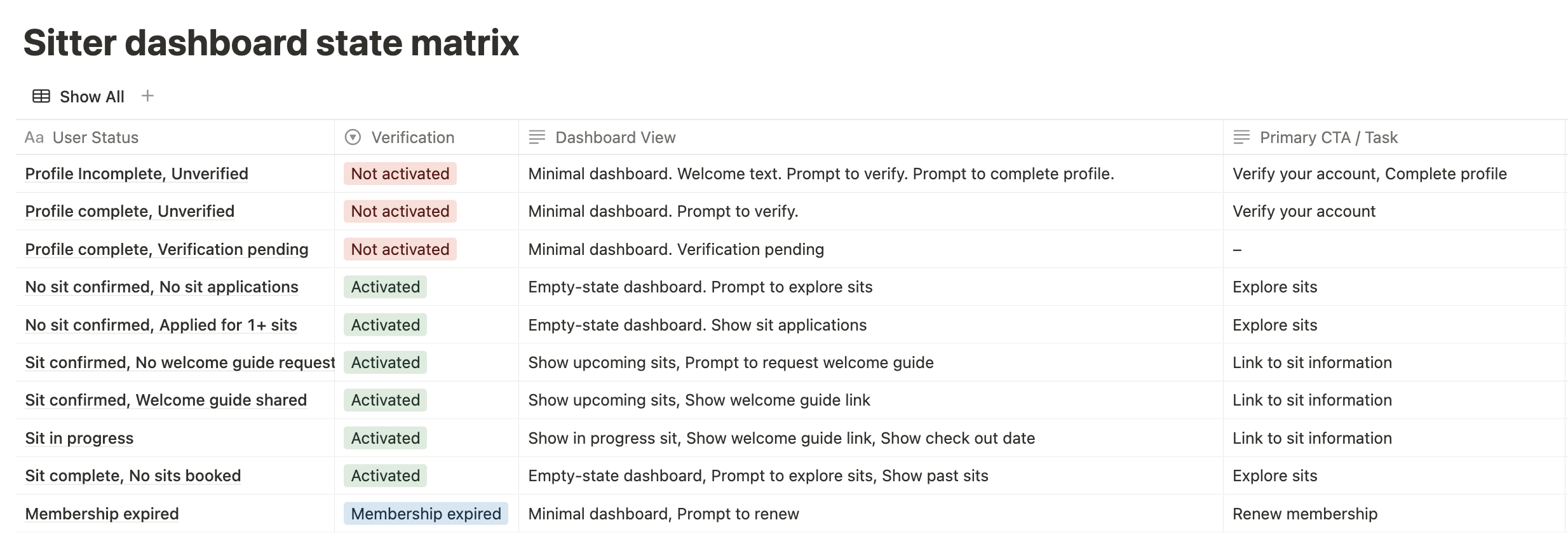
3.State mapping
I mapped all the key phases from the task flow into a simple user journey diagram, but this time documenting how the state of the dashboard changes. This was then translated into a “state matrix” deliverable to align the team on the states we had to ensure were reflected in the design.
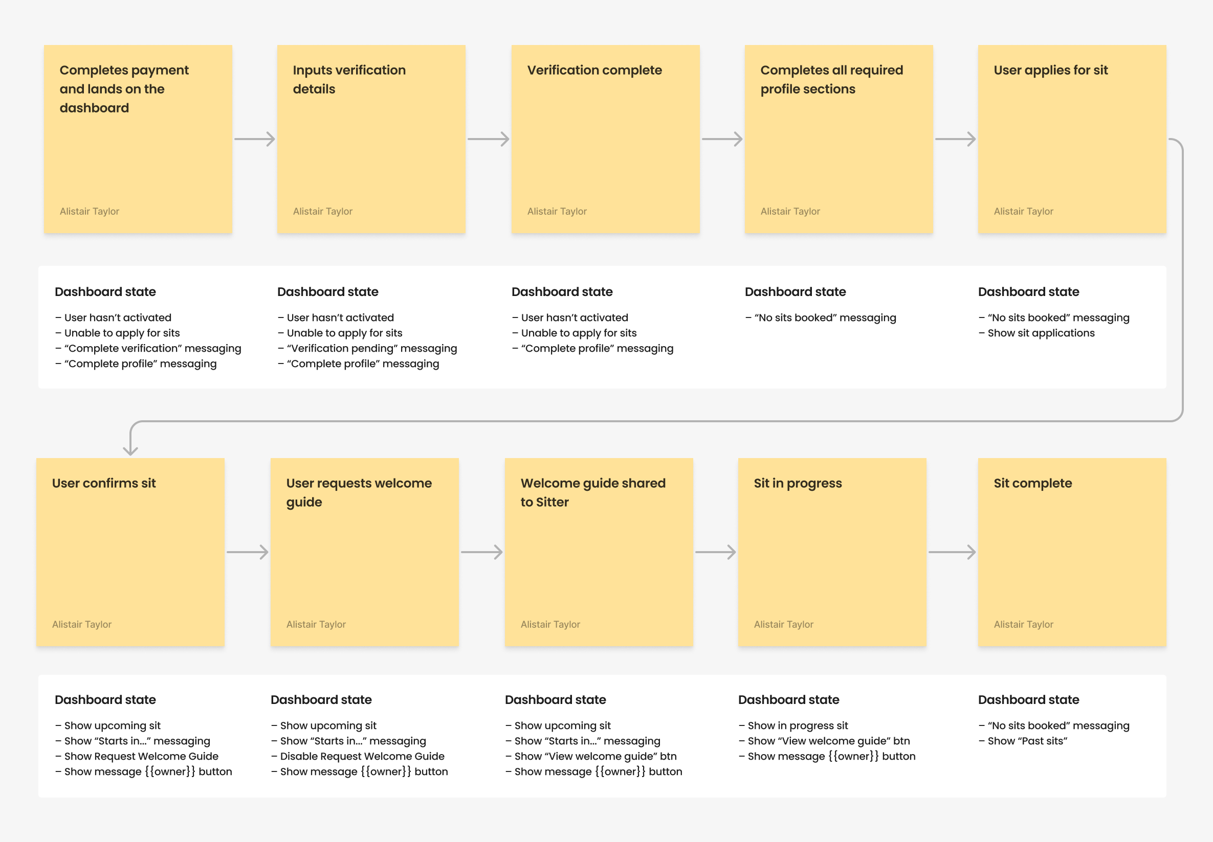
Foundations in place
The task flow analysis and state matrix work laid critical foundations for the redesign. By thoroughly mapping every possible user state and interaction, including rare edge cases, we ensured nothing essential was overlooked. This comprehensive groundwork gave the team full confidence to simplify and restructure the dashboard without missing key functionality.
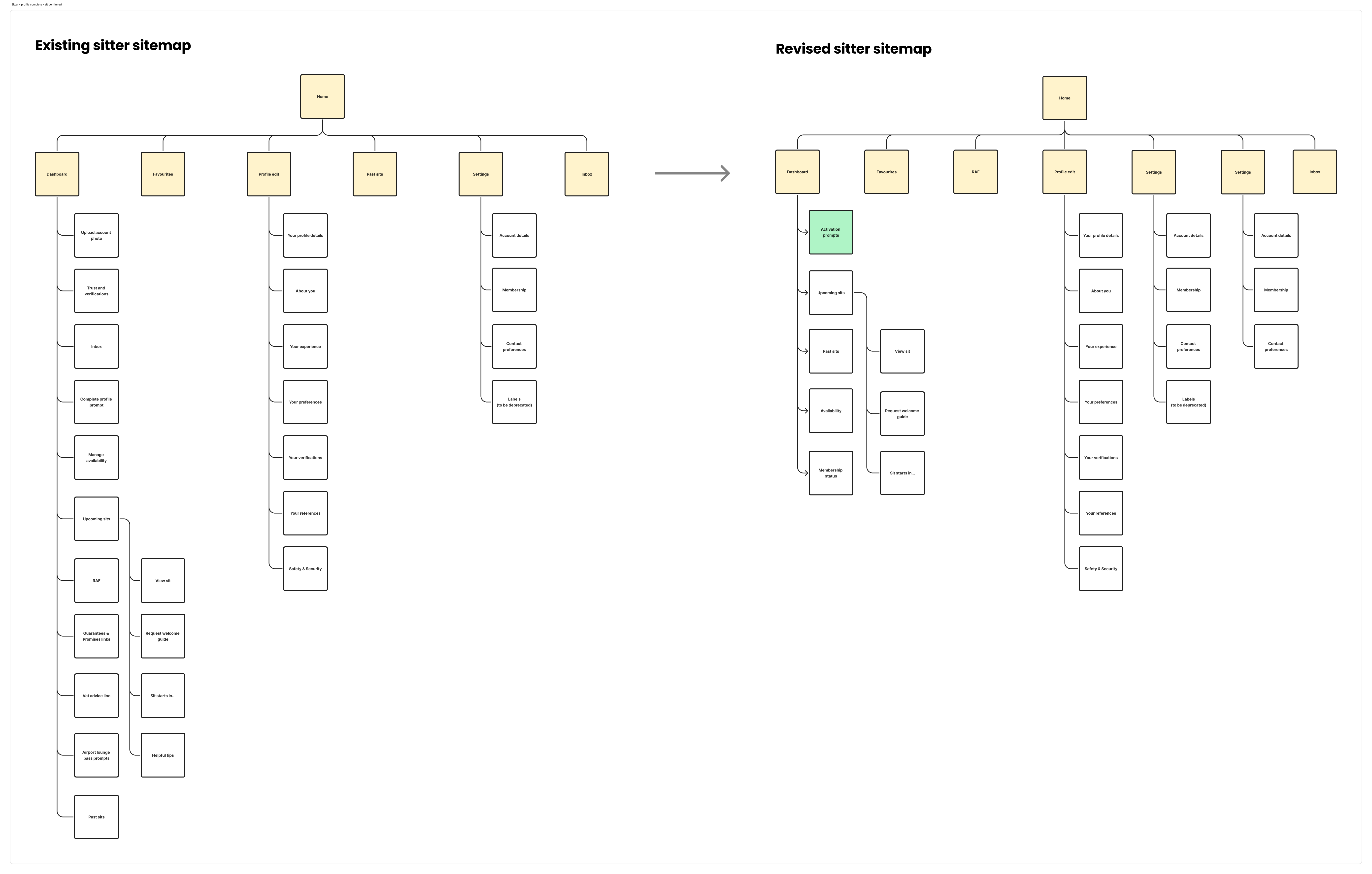
4. Exploring I/A approaches
With all key user tasks and states mapped, I outlined the existing site map for pet sitters. The sitemap maps out all the pages central to the pet sitting experience, so omits pages such as Home, About etc.
Over time, much of the functionality that is housed on the dashboard had been migrated to other parts of the platform. For example, the trust and verifications sidebar module (as can be seen in the existing design above) is also housed witin the Edit Profile page. Therefore it felt superfluous to have repetition. I took the opportunity to remove duplicate functionality and refine the dashboard into as concise a state as possible.
This can be seen in the stripped back sitemap on the right below.
5. Sketching & ideation
During the ideation phase, I explored multiple approaches to restructuring the dashboard’s layout and information architecture. Through sketching and iteration, I tried out different ways to break up and present content more clearly. The screens below are essentially a quick snapshop of the scrappier, sketching phase I often go through in projects before refining ideas down into higher fidelity prototypes for testing.
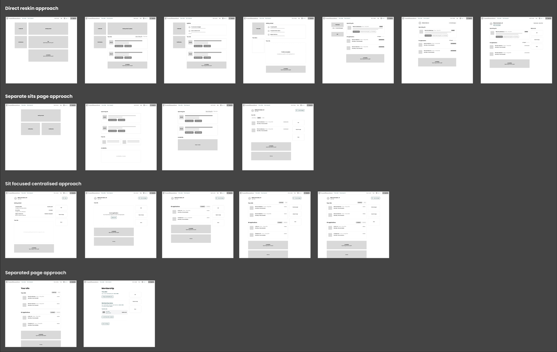
5. Prototyping varying approaches
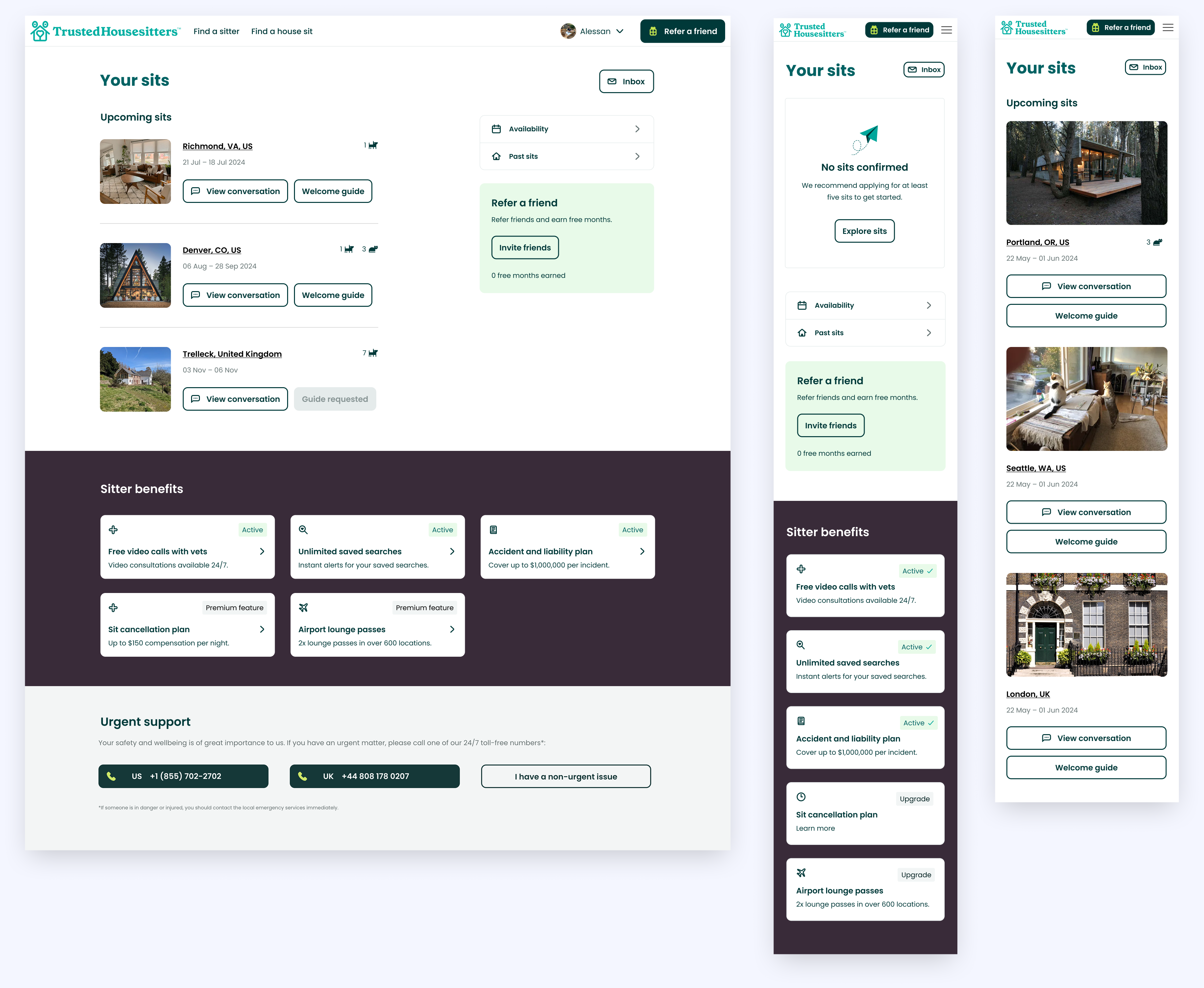
Building off the more broad exploration from the ideation phase, I refined the ideas into four core concepts to review and evaluate, using a mobile first approach to all designs.
The first approach moves away from having all the content on one screen, having separate views for sections such as "Availability". The second retains having all information on one screen but strips out unnecessary elements so it is more concise. The third explores having a tab based approach more like a native app, this would be made possible if we had centralised notifications. The fourth design strikes a balance between options one and two.
Choosing direction
After discussion with the squad and the wider product team, the design to take forward was closest to option four. This approach manages to remove lots of redundant content, streamlining the experience, without having to rely on introducing more high effort functionality such as notifications.
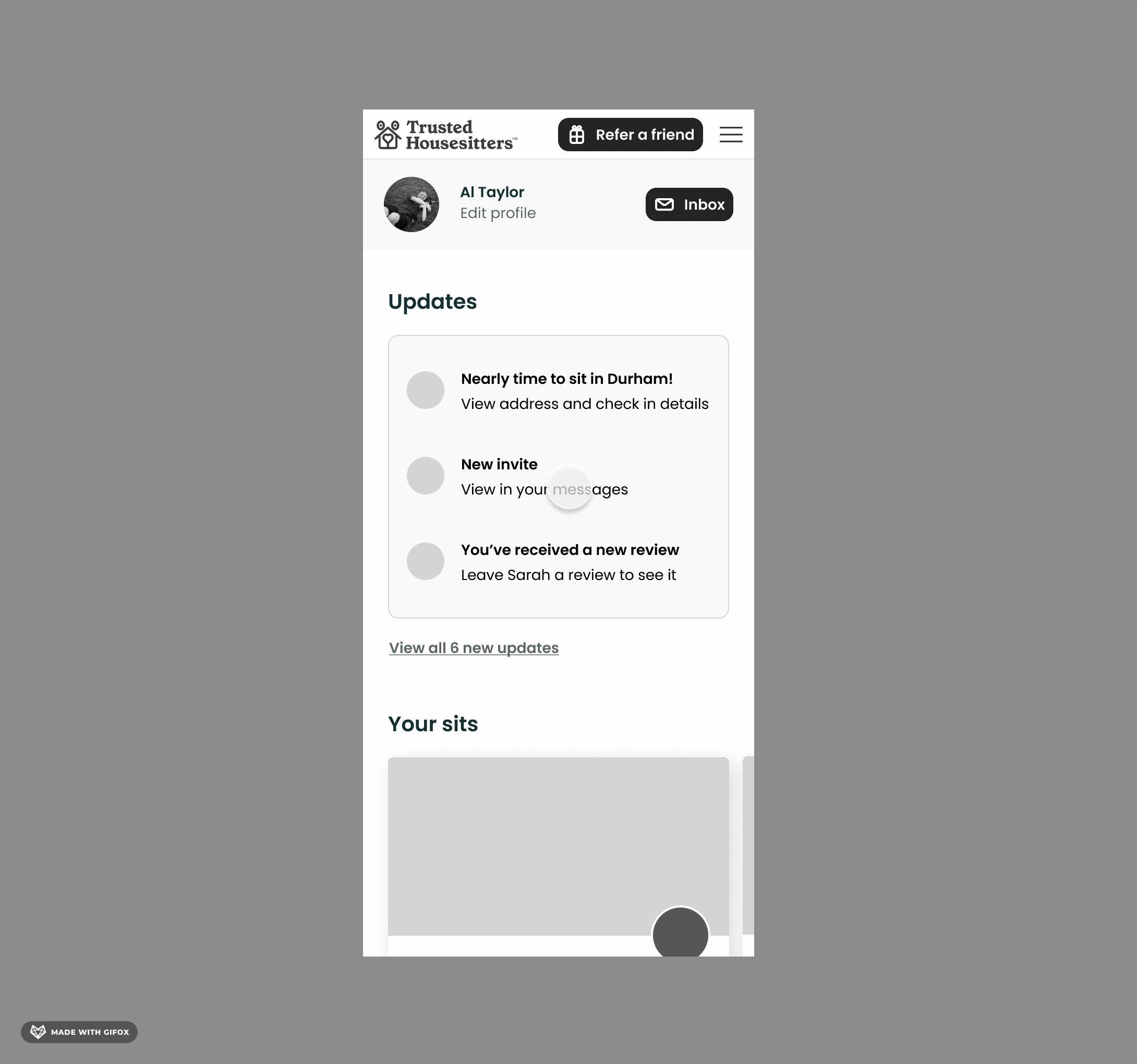
6. Final designs & usability testing
Using the design system, I built out the final design ready for usability testing, Only two new components had to be created and added to the system: the refer a friend card and sitter benefit cards.
To validate the design, I conducted user testing with five participants. Since it was difficult to recruit users who had just completed a payment (the key user group), I broadened the pool to general users from UserTesting.
The crucial task to test was whether users would easily be able to understand that they need to complete verification and complete their profile to get started. All five users had no issues, so task completion was 100%.
Testing and tracking
We decided to launch the dashboard using a feature flag, rather than A/B testing. This basically means the team can “turn off” the redesign and revert back instantly if needed. We had high confidence in the design, meaning that waiting for an A/B test to reach statistical significance – at least 6 weeks – felt unnecessary.
We monitored the following key health metrics closely:
- User verification success rates
- Time to verification
- Profile completion rates
- Time to profile completion
Post launch there were no issues with the metrics, indicating the design was a success. We in fact saw a positive impact as detailed below.
Results & conclusion
The redesigned dashboard successfully addressed legacy usability issues, providing a cleaner, more intuitive experience for pet sitters. By removing redundant features, decluttering the interface, and improving the information hierarchy, we helped users focus on the most important actions with less friction.
Post-launch metrics confirmed clear improvements in user efficiency:
Time to profile completion dropped from 5:10 to 4:33 seconds — a 12% decrease
Time to verification dropped from 2:23 to 1:15 seconds — a 47.6% decrease
These improvements showed that users were able to navigate the dashboard and complete critical onboarding steps more efficiently, thanks to a better layout, clearer task prioritisation, and a simplified experience.
A scalable foundation
Rebuilding from the ground up allowed us to eliminate legacy code constraints and create a future-proof experience. The new dashboard uses just two additional components, keeping the build lightweight and aligned with the design system.
Improved usability
Despite limitations in recruiting our exact target group, usability testing showed strong results — all five participants completed the critical tasks successfully. The improved structure clearly communicated the need to complete both profile and verification steps before applying for sits and provided a clearer pathway to do so.
Confident release
With no historical usage data available, we launched the new dashboard using a feature flagrather than A/B testing. This allowed us to roll back instantly if needed, but monitoring showed no issues post-launch — only improved metrics and a more streamlined user journey.
Next project
Increasing membership acquisition