The Process
Outlining requirements
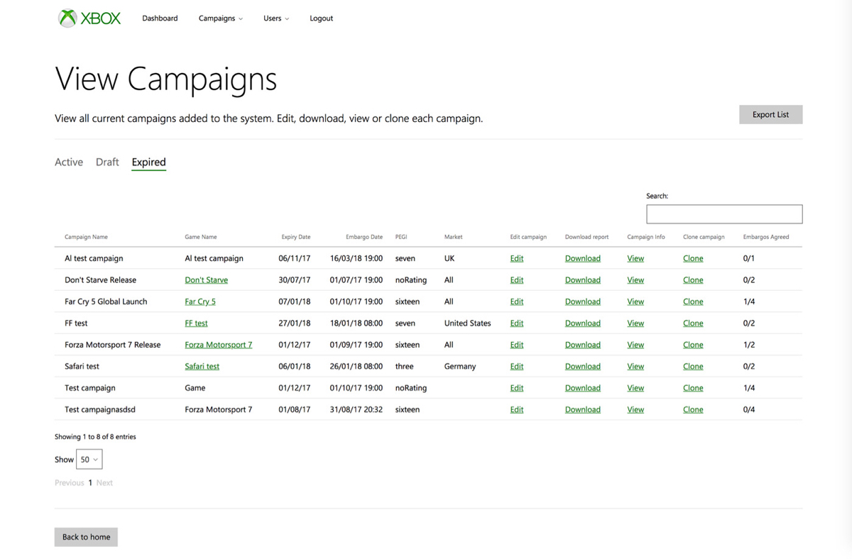
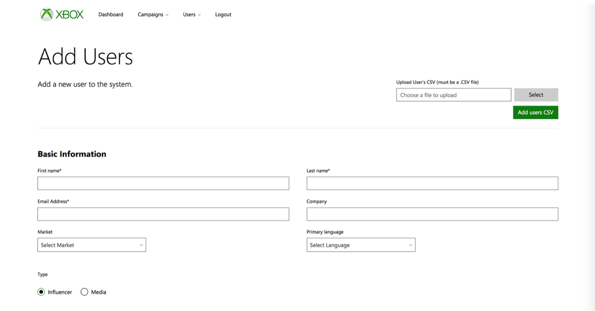
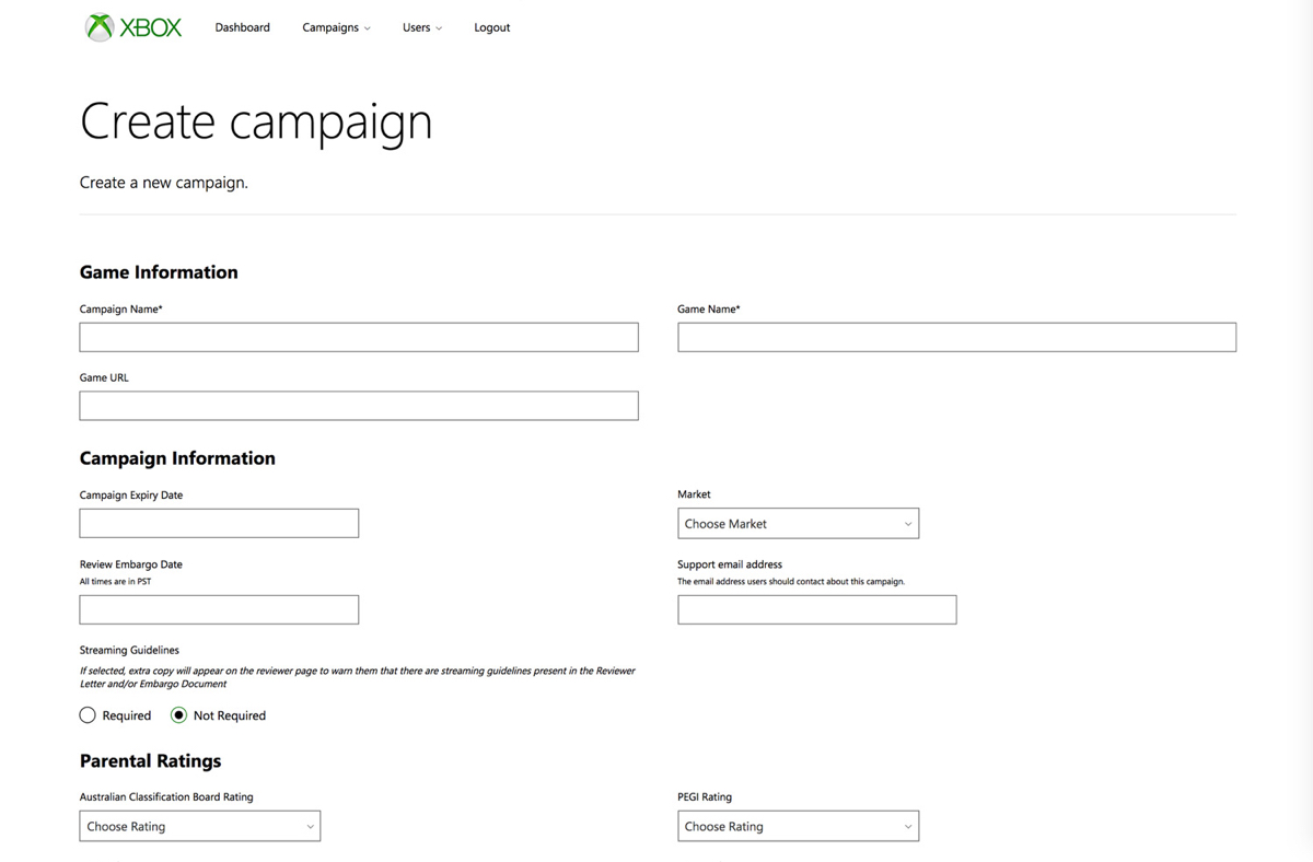
As simple as sending review codes out may sound, the campaigns were fairly complex. The functionality was required for admins to create campaigns with details such as embargo dates, markets, streaming guidelines, launch dates, custom images, regions, disclaimer text, parental ratings by region and more. The ability to view active, draft and expired campaigns, edit existing and live campaigns, download reports and bulk upload users by CSV was also required.
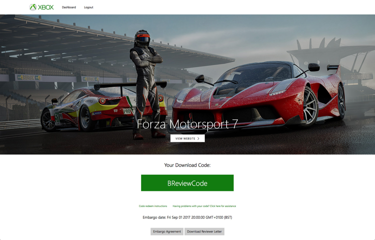
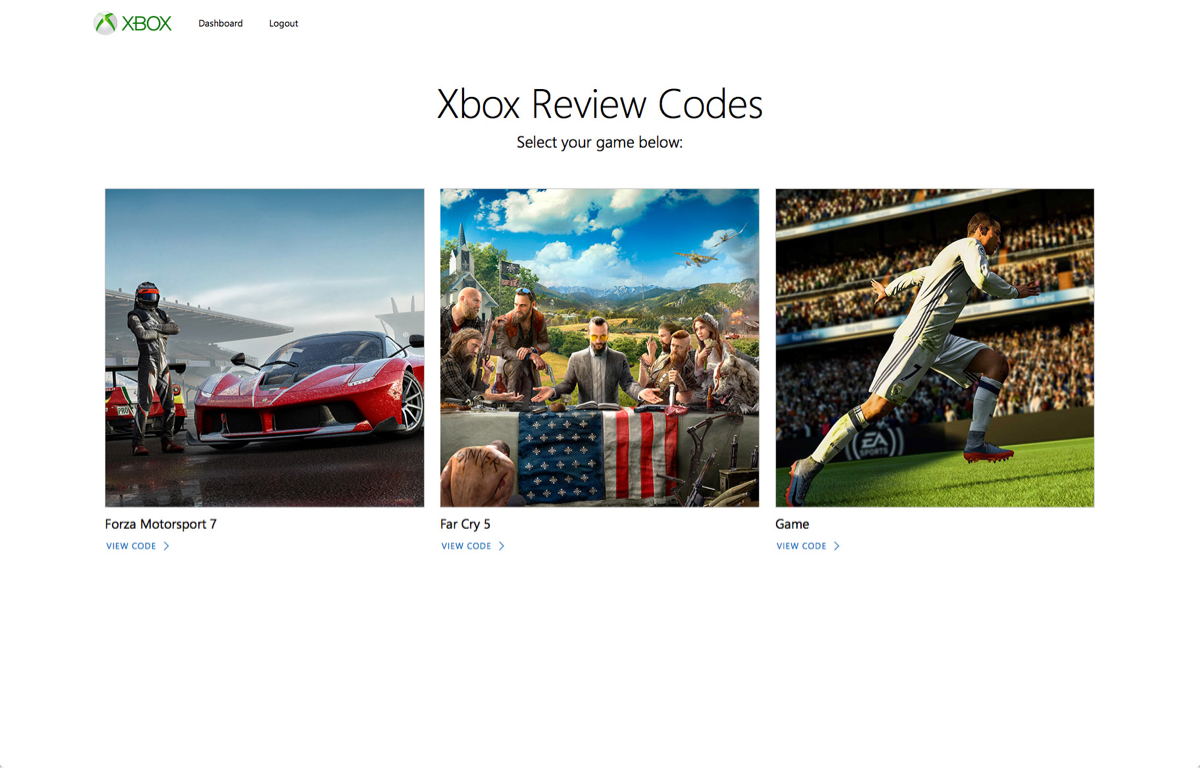
There was also the user route to consider, we were required to create a hub for reviewers to access and manage their download codes. With this level of functionality, It would be easy for this interface to become extremely complex and convoluted - there could be far too much information for the user to process on each screen.
User Flow
To break down the complexity of the admin route, I rapidly outlined the flow of tasks users must complete and undertook quick mock ‘scenarios’. I would then look for ways to refine the user journey and iterate the flow of tasks accordingly.
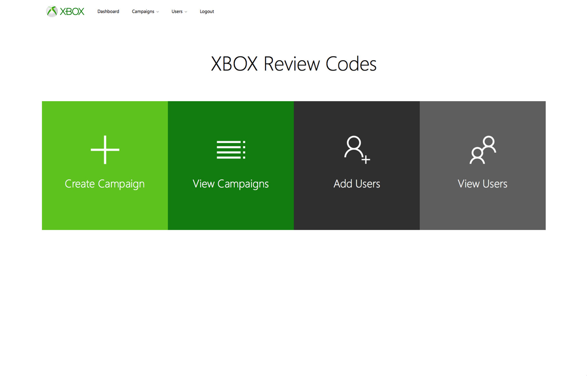
By walking through these scenarios and reiterating the flow, I learnt that the best option was to split the user journey into three main directions: viewing and uploading recipients, viewing and editing active and past campaigns and creating a new campaign.
Sketching, testing & iterating
We built up sketches of each screen of the interface, laying them out in the order of the user journey defined in the previous stage. With the team, we could then walk through each stage, quickly highlighting and re-sketching improvements.
When we had designs of each screen we were happy with, we created slightly more refined sketches of the interface and performed some simple user testing. We asked users to "think" aloud when completing the key tasks to create and send a campaign
We found several small refinements from the testing, but a key finding was that the way recipients were added was clunky. It made more sense for the recipient list to be managed in a separate view, allowing them to be added from a list at the end of the campaign creation. When we were happy with the designs we created wireframes ready for developer implementation.
