Pay AU Payment Platform

Designing an innovative new payment product

Back to homepage

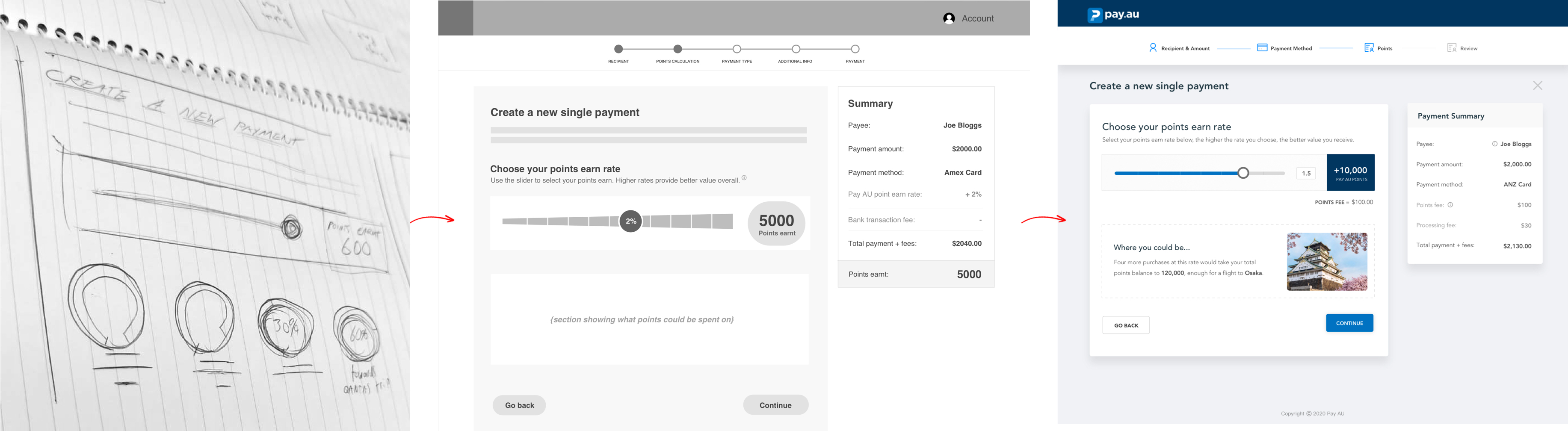
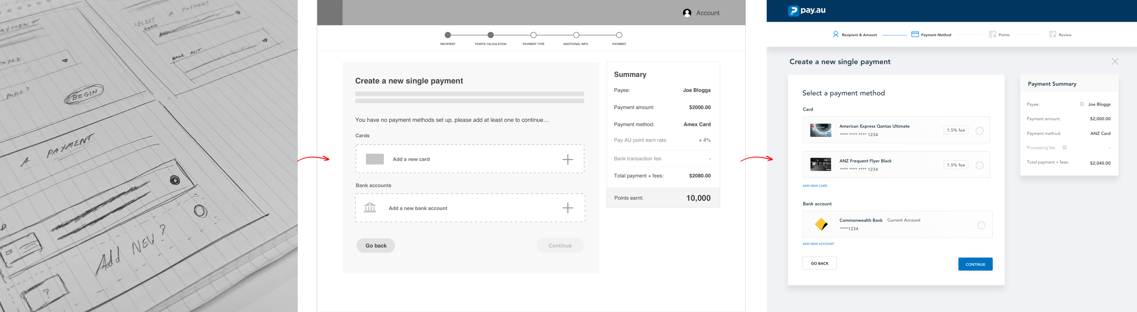
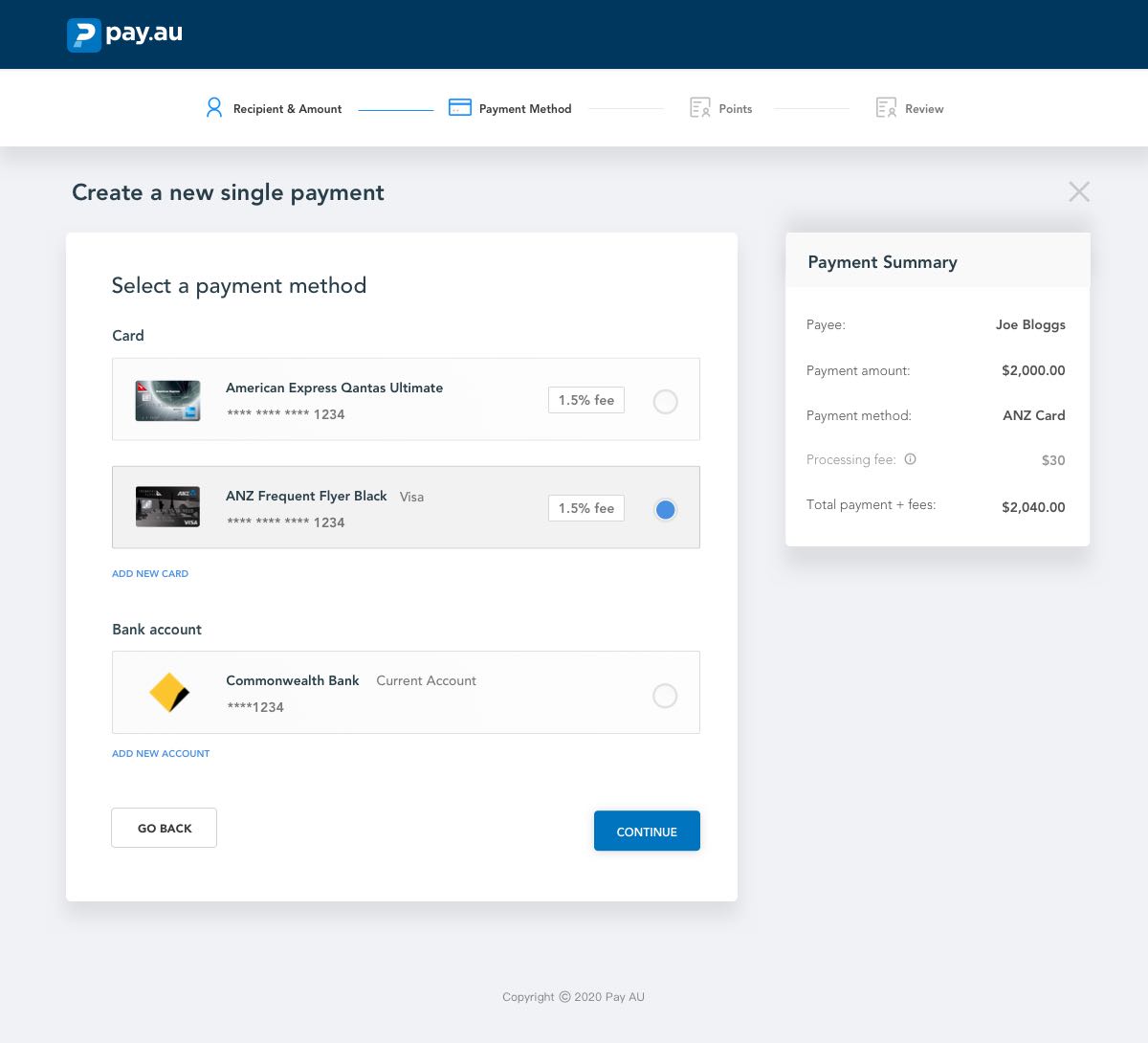
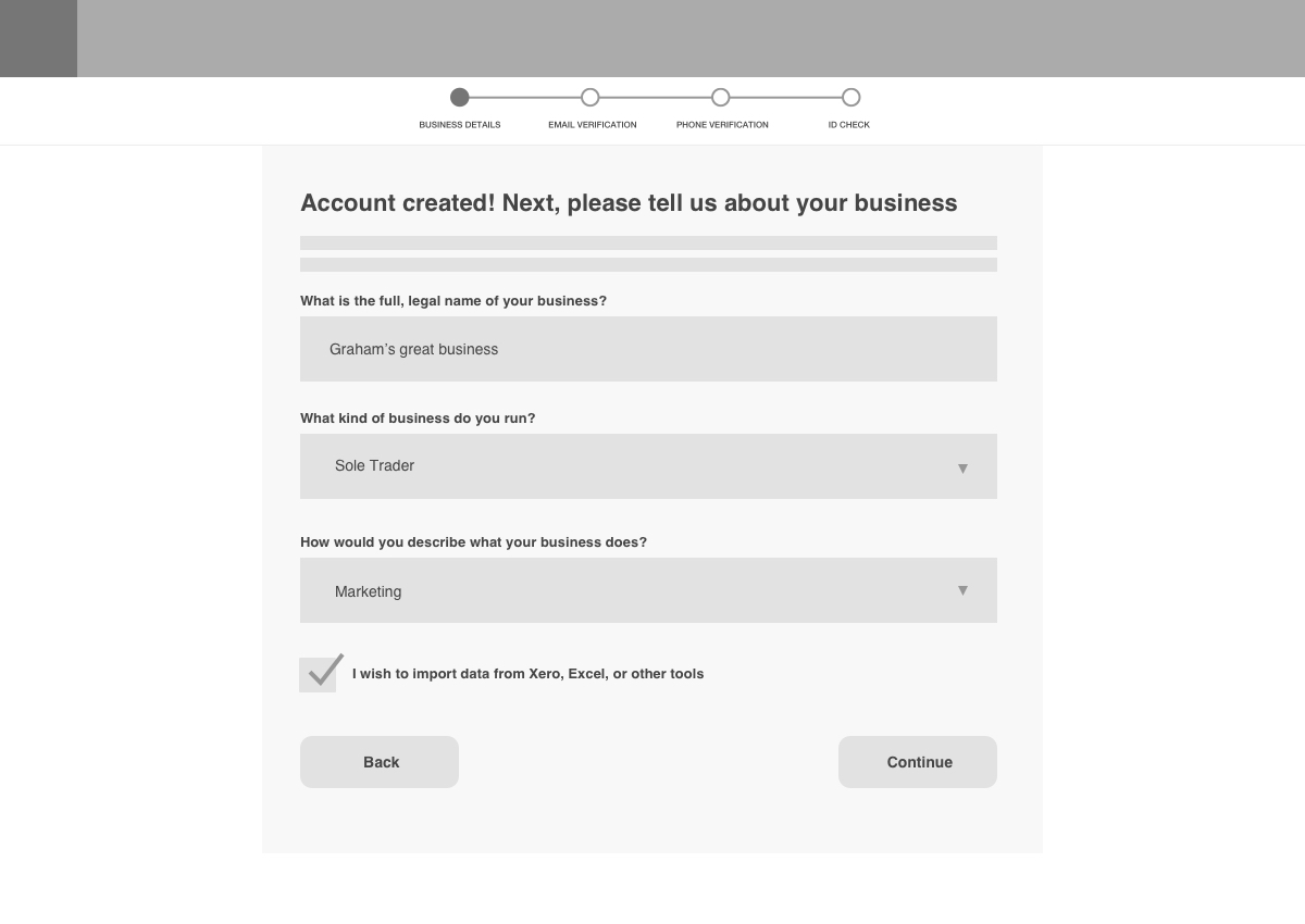
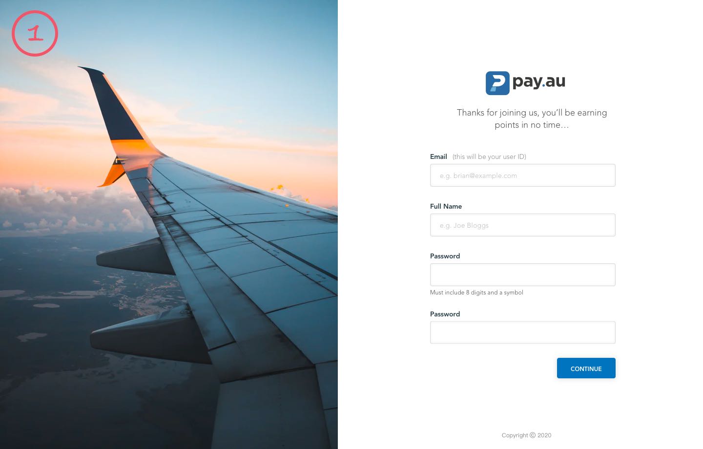
Pay AU is a platform that allows users to earn frequent flyer points while making everyday business payments. I was responsible for designing, testing and iterating the two key user flows, followed by the UI & Visual Design for the entire product

Project objectives

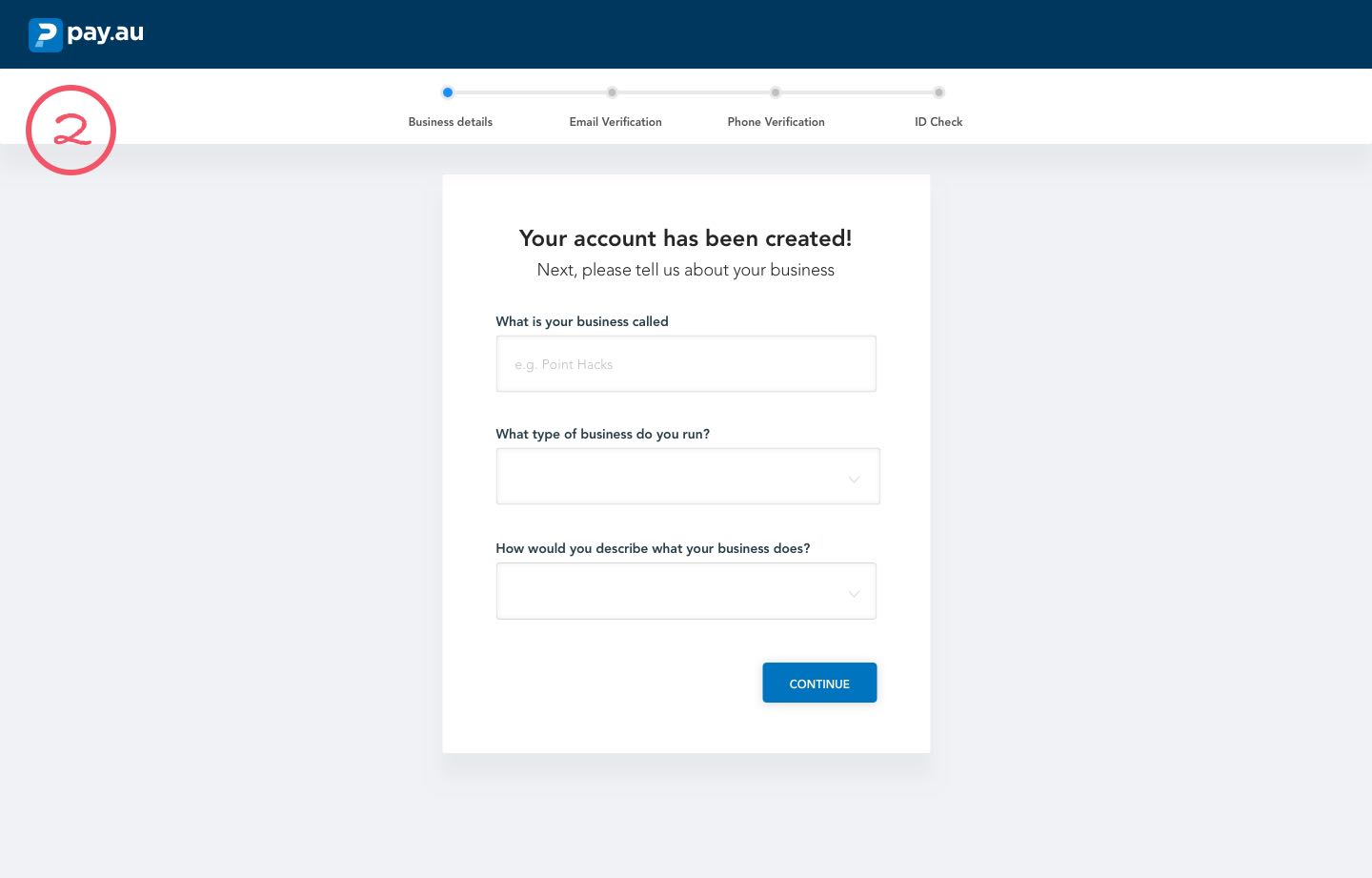
  • Design a simple, intuitive payment platform that provides a delightful user experience
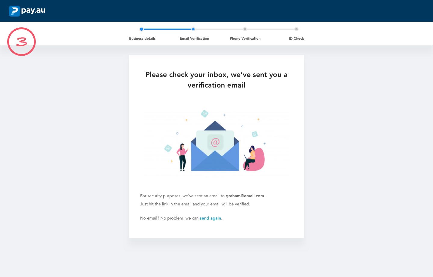
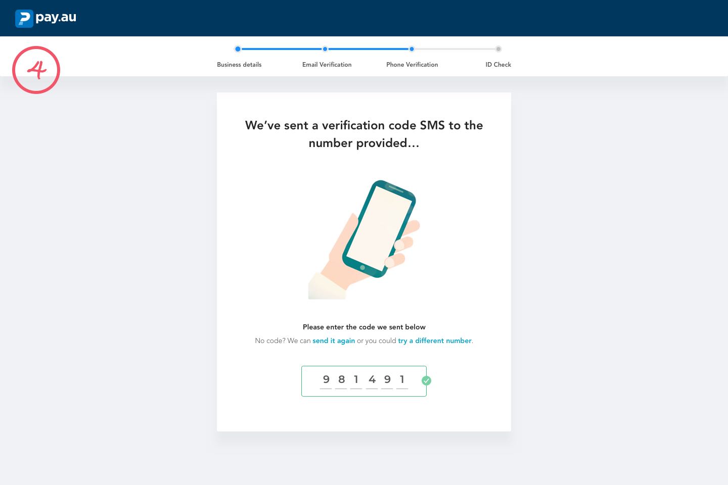
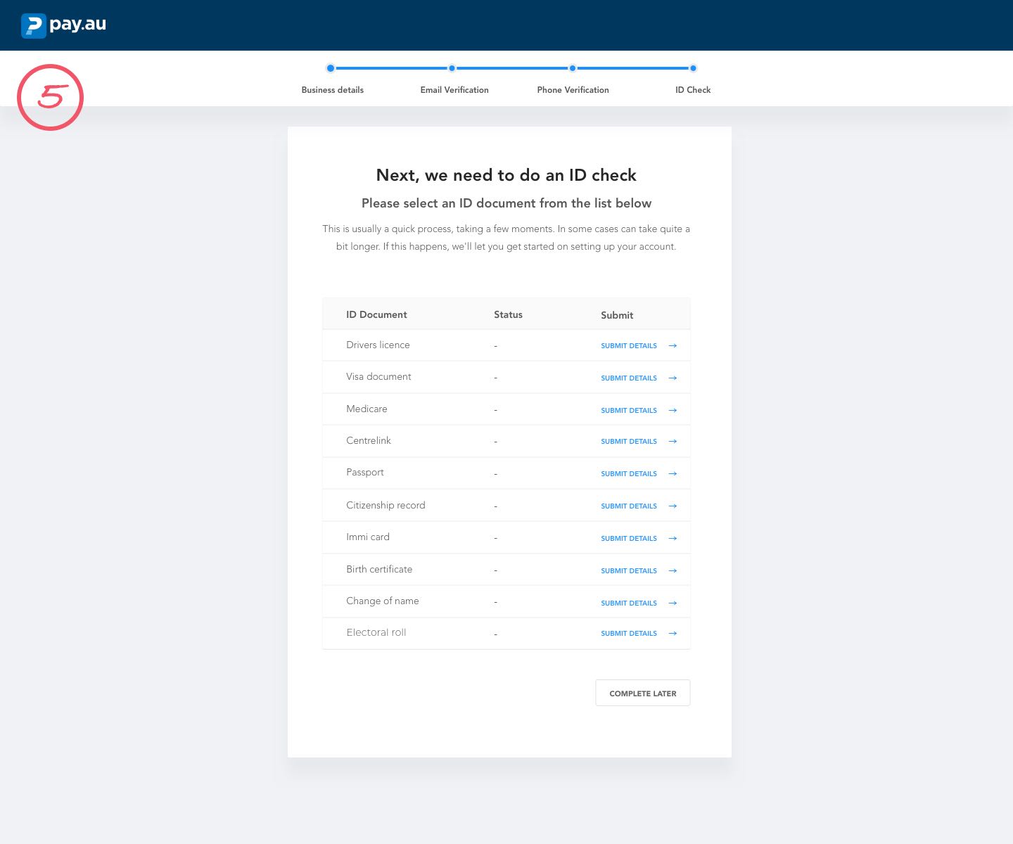
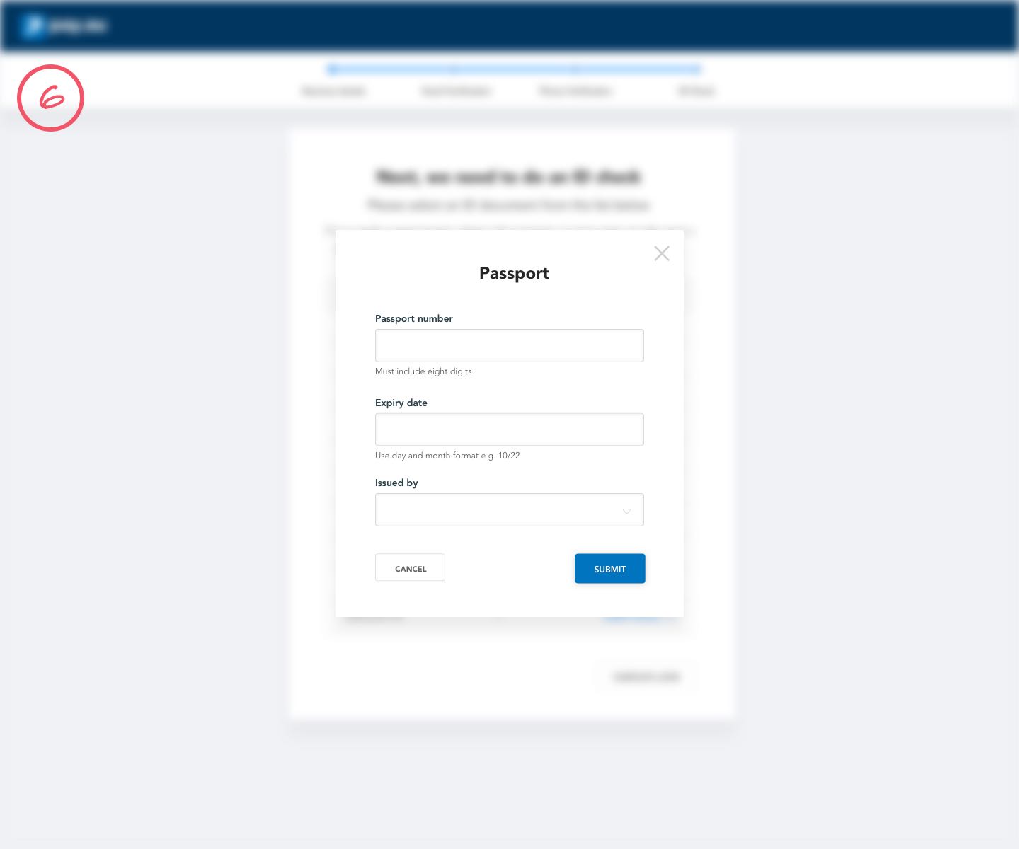
  • Conduct an iterative process to design, test and refine each key user flow within the product
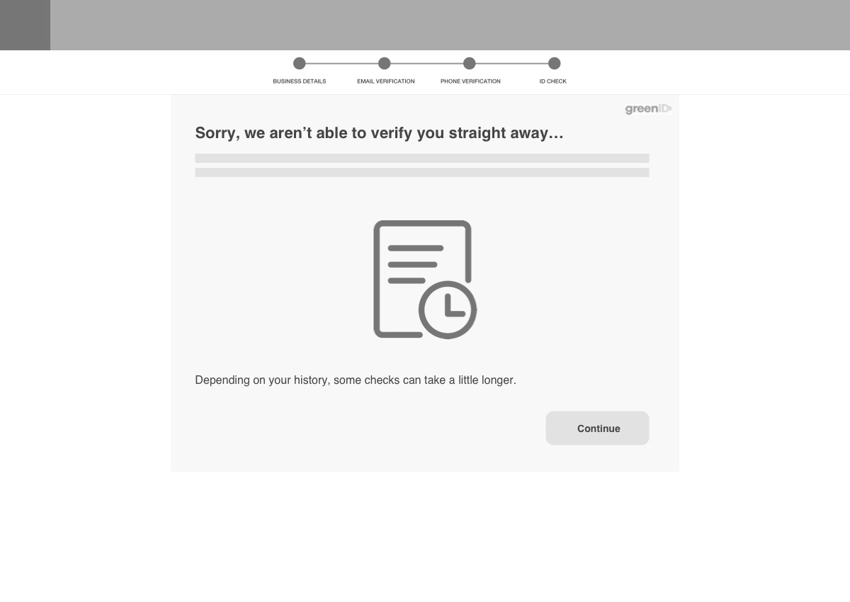
  • Usability test the products key features
  • Create a contemporary visual identity for the product to complement and enhance the overall user experience
  • Collaborate with senior stakeholders to plan and prioritise features for launch

View wireframe prototype

View key screens PDF

View component library PDF

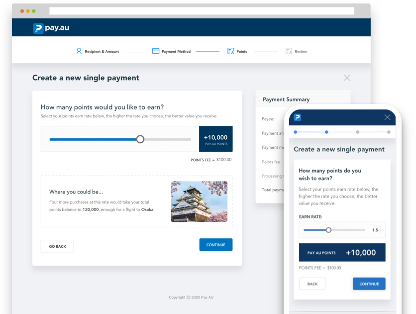
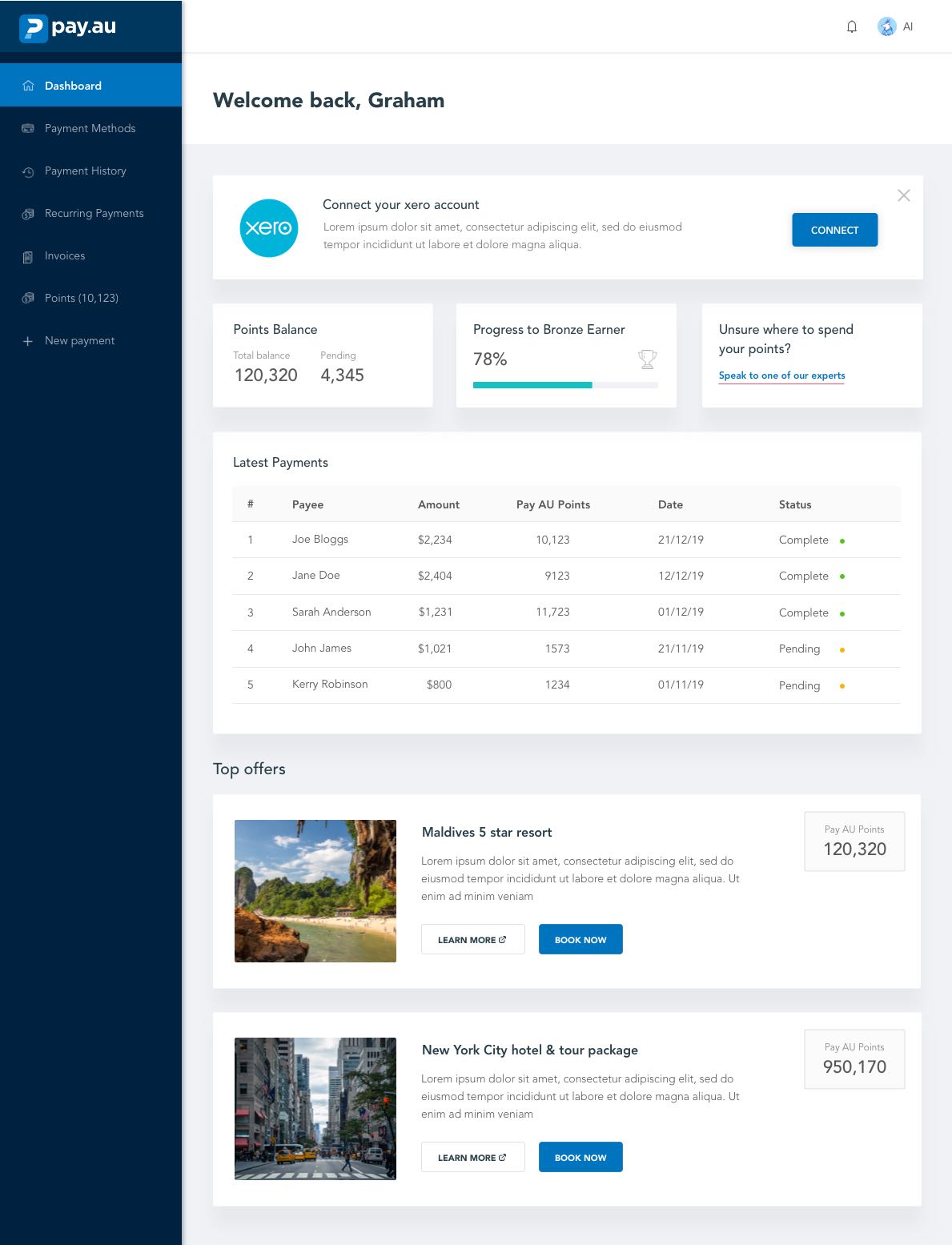
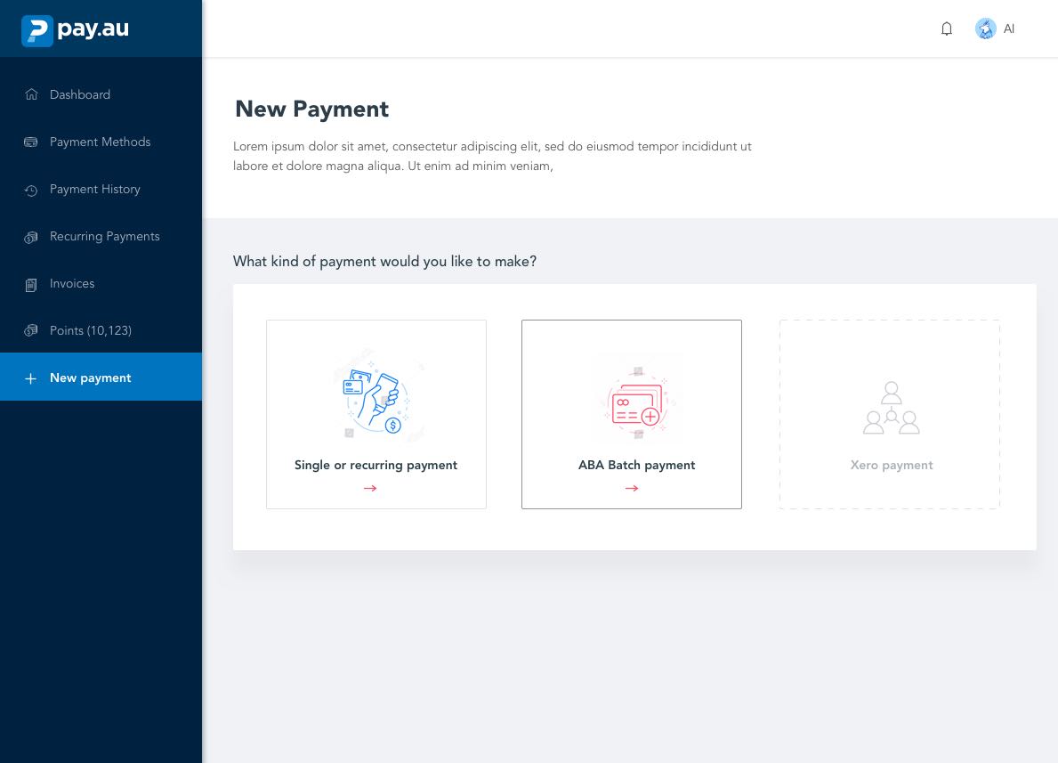
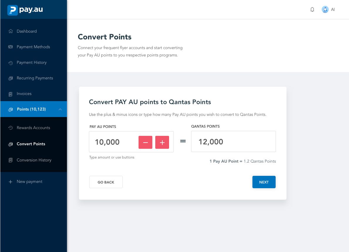
Pay AU's key product features allows customers to:

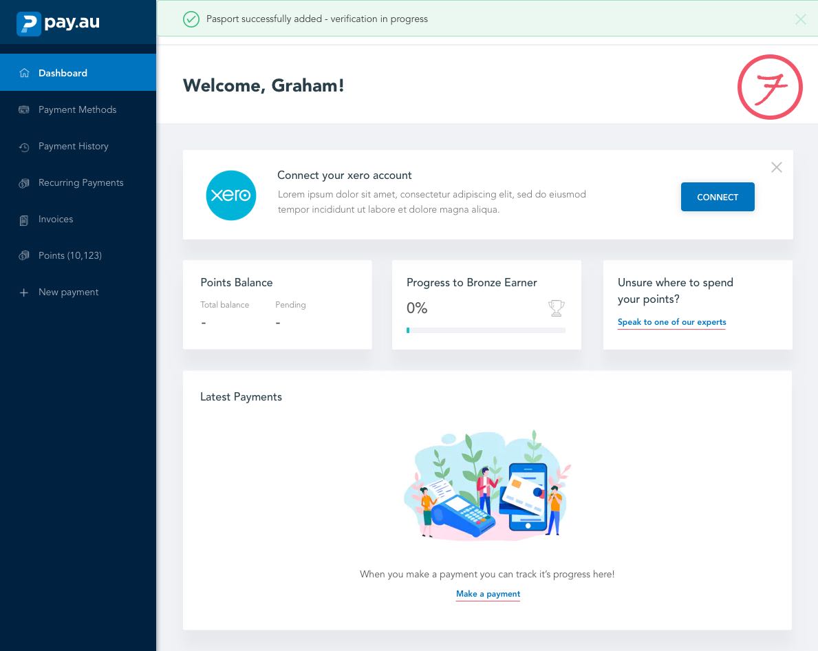
  • Earn PAY AU points while making their business payment
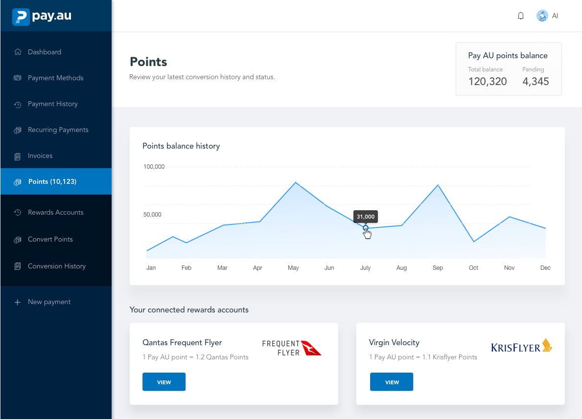
  • Convert their Pay AU points to different frequent accounts e.g. Qantas, AirPoints, Krisflyer.
  • Store all their different payment methods and cards in one handy place
  • Access a points wallet, where they can view their Pay AU balance value in corresponding rewards accounts
  • Access a dashboard that gives them an overview of payment status, deals, points balance etc.
  • Connect accounting software such as Xero to automate invoice payments

Overview of process & tools used

1) User flow mapping, and sketching & prototyping

I started off sketching screens for each of the two key user flows. I stuck sketches to the wall in order of each screen, allowing me to quickly assess each screen, tear down a design and quickly make changes. When I was happy with the sketches, I built them out into medium-fidelity wireframes in Sketch, then created a clickable prototype using InVision.

2) Testing & Iteration

I conducted quick guerrilla-style usability testing on the prototype with five test participants. I introduced participants to the project, then asked them to “think aloud” as they completed key tasks on the prototype. Once complete, I updated the designs accordingly.

3) Designing remaining user flows and key screens

With the key user flows complete, I created wireframes all other key screens and user flows

4) Visual design and component library development

I created visual designs for each key screen, then created a fully annotated component library of all UI elements to communicate visual design to developers.

pay au

Creating an intuitive payment flow

The "make a payment" flow is the most important area of the whole product. This is where users earn their points, it's the main feature which will keep them coming back if they find the experience useful, intuitive and pain-free.

Within this flow, users select or create a payment method, select or add a new payee, select how much they need to pay and most importantly choose how many points they wish to earn by selecting an "earn rate".

When money is involved, users are far more in tune with how trustworthy they find a product. Therefore, clarity of payment information such as fees and the "point earn rate" are absolutely vital - we need to make users feel safe and secure.

Similar to the onboarding flow, it was essential not to bombard users with loads of input fields, so I opted to break them up over several screens, again with a progress bar. This also has the benefit of being able to dedicate a whole screen to the "Points earn" screen.

Through sketching and iteration, I decided to split the payment flow into two windows. One would contain the payment information fields such as payment method, points earned etc and the other would contain act as a persistent sidebar, displaying a summary of payment fees which updates depending on user input.

I explored several options for the point earn view but decided on a large size slider as this allows user to fine-tune how many points they can earn. This method also helps to "gamify" the process as users can experiment with different amounts, perhaps enticing them to op for a higher point spend.

"Make a payment" user testing results

  • Users felt the amount of content on each screen felt correct
  • Several users commented that the payment fees added for the point spend and payment type weren't clear - I needed to add prominence to them
  • One user noted that they hadn't noticed the info in the sidebar updating in real-time - this could be addressed with a subtle refreshing animation or spinner icon
  • Another user didn’t see the fee added on the card page. “Why have more fees been added,'' - he said he didn’t feel this was clear enough.
  • As can be seen from these results, there is a lack of clarity of fees added, despite my attempts to make them as clear as possible. Part of this may be due to the visual design layer not being present, but I believe these results demonstrate the importance of highlighting usability issues early in the project. Users experiencing these issues on the live product would of been disastrous.

Quick overview

  • Similar to the user onboarding, I decided to split the flow into several screens, aided with a progress bar
  • Through experimentation, I decided to split the view into two windows, one would contain payment info, the other a sidebar to summarise all payment information
  • I experimented with different options for how the user can select how many points they earn and decided on a large slider
  • User testing validated the idea of the progress bar and two-window view, but revealed a lack of clarity of payment info despite my attempts to make it as clear as possible

Designing a frustration free onboarding flow

As I was designing a payment product, the onboarding process is more complex than most products; there are security checks and verification that users must pass. With these extra steps, how could we create a smooth onboarding flow that doesn't frustrate users and prompt them to leave?

Looking at competitor onboarding experiences, I could see they break down registration fields into several screens, often with a progress bar. This seemed like the appropriate approach considering the complexity of our product requirements. However, this approach has its risks, if the process is broken down into too many screens - users will become frustrated. How could we find the "goldilocks zone", with the perfect amount of digestible content on each screen?

How could we find the "goldilocks zone", with the perfect amount of digestible content on each screen?

Using the sketching approach previously mentioned, I quickly drew each screen of the on-boarding process, experimenting with different amounts of content on each screen and iterating until the amount of content felt correct. A concern was that the amount of verification info required from users can be quite extensive, and varies depending on the users financial history. We don’t want to scare users off with the amount of interaction required from them, so we opted to allow them to verify their account later if they desire. Once I was happy with my sketches, I built them out into a clickable wireframe prototype using InVision, ready for usability testing.

Onboarding user testing results

  • In general users felt the amount of content on each screen for the verification process felt right and wasn’t overwhelming
  • Users loved the progress bar, one said he felt like he knew what was coming next and knew to have his phone handy
  • As the onboarding length is longer than most products, one user wished the length of time required had been communicated on the opening screen
  • One user felt there were too many screens for the initial user details.

Quick overview

  • I broke down the on-boarding process into several screens to reduce pressure on users and help with error prevention
  • I experimented with different amounts of content on each screen through iteration & sketching
  • I experimented with different options for reducing the workload for users ID verification
  • I conducted usability testing to test designs and found only minor tweaks were required
pay au onboarding screenshot

Designing the remaining features

Although more time had been dedicated to the two most important user flows, there were several other screens and features to design.

I followed a more standard process for these other, less complex areas of the product. I created wireframes each section, sketching out some of the more tricky areas on a note pad, but with less time and focus on iteration. When the wireframes were signed off, I made further UI tweaks in the visual design stage.

Other areas of the product included:

  • Points conversion screen
  • Conversion history
  • Connecting reward accounts
  • Payment history
  • Recurring payments
  • Invoices
  • Account settings

Visual design & component library development

I felt that for the nature of the product and its audience (business owners and managers), the visual design for the product needed to feel professional and trustworthy, yet still have a friendly and conversational feel to it. This is reflected in the choice of soft blues to convey feelings of trust and calm, with a conversational writing style to make users feel as though they are in a relaxed and friendly space.

I created a component library of all UI elements, fully annotated for developer implementation.

  • Soft blues convey a professional yet friendly feel
  • Subtle rounded corners help avert a corporate edge to the design
  • The font choice of 'Avenir' helps give the design a friendly tone

Wrapping up

Since launch, the platform has been highly successful and has secured "Series A" funding.

View website

Here are some of my personal key learning from the project: