For the successful launch of Pay AU, it was essential that the platform enticed and informed customers with a compelling, well-designed website. To do this I undertook a lightweight UX process comprised of personas, user journeys, wireframes & iteration, before moving into visual design.
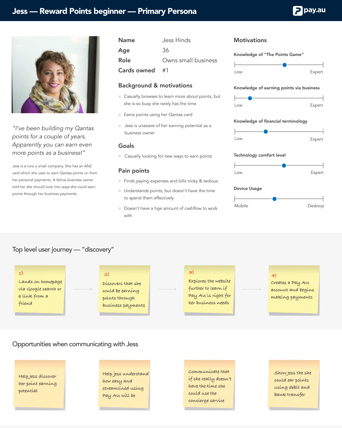
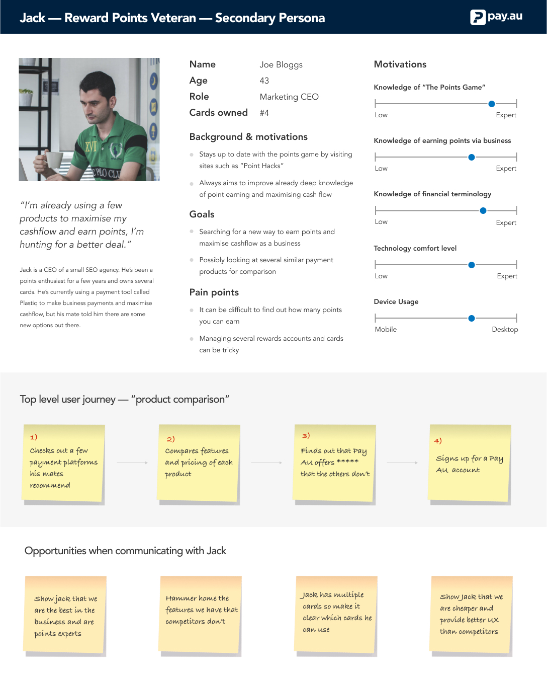
Personas and user journeys explored users backgrounds, goals and pain points, helping structure the site's content, aesthetic and visual hierarchy based on their needs and demographics.
It was important to work with the Pay AU team and help understand that there was more than one type of site visitor and that their goals and needs may vary. There is a clear distinction between someone who understands rewards cards and someone who understands how they can earn points as a business. The site had to cater for both of these user types.
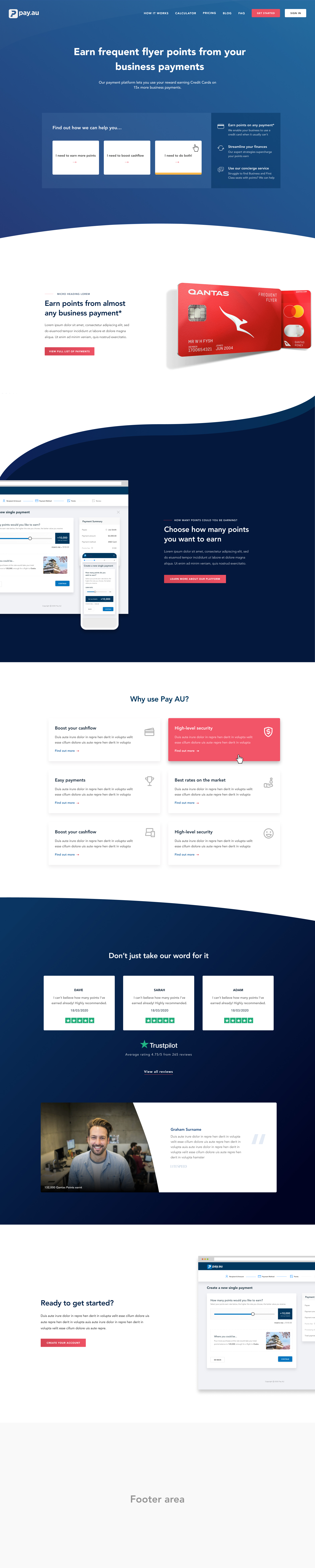
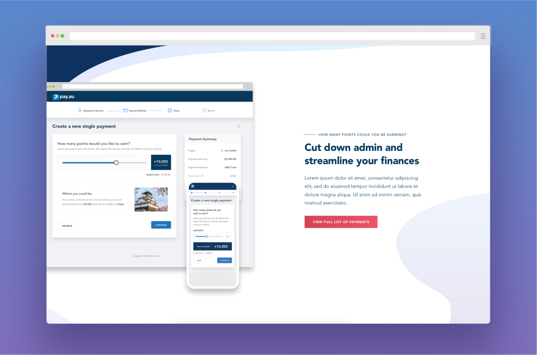
Below is the first draft for the Pay AU launch website. The design focuses on giving each key features plenty of breathing space, allowing users to easily digest information and learn about Pay AU’s key features. Images are placeholder.