For a year, I worked with the Everpress team to help improve their sales conversion rate KPI. Combining user research and data insights, we uncovered key obstacles in the buyer journey, paving the way for a series of A/B tests aimed at streamlining how users navigate the Everpress platform.
User research
We started with 10 user tests to discover pain points and opportunities on the platform. The tests were end-to-end across the whole buyer experience, from first landing on the homepage to making a purchase. Users were asked to:
- Explore the site and gain an understanding of the value proposition
- Explore and find a product that they like
- Make a purchase
The tests were intentionally broad to allow users to fully explore the platform.
We also conducted an onsite survey using HotJar asking users how their experience could be improved.
Among many findings, the most crucial discovery was that users were finding it hard to explore the site and find products – this was also reflected in MixPanel data.
This shifted our focus to discoverability and creating the hypothesis that if users can find products they like quicker and easier, they will be more likely to purchase.
Ideation and Hypotheses
We generated several ideas for new designs which could improve discoverability. We then assessed which ideas would have the most impact with minimal effort. Below you can view the final designs and hypotheses that we took forward for usability evaluation and A/B testing.
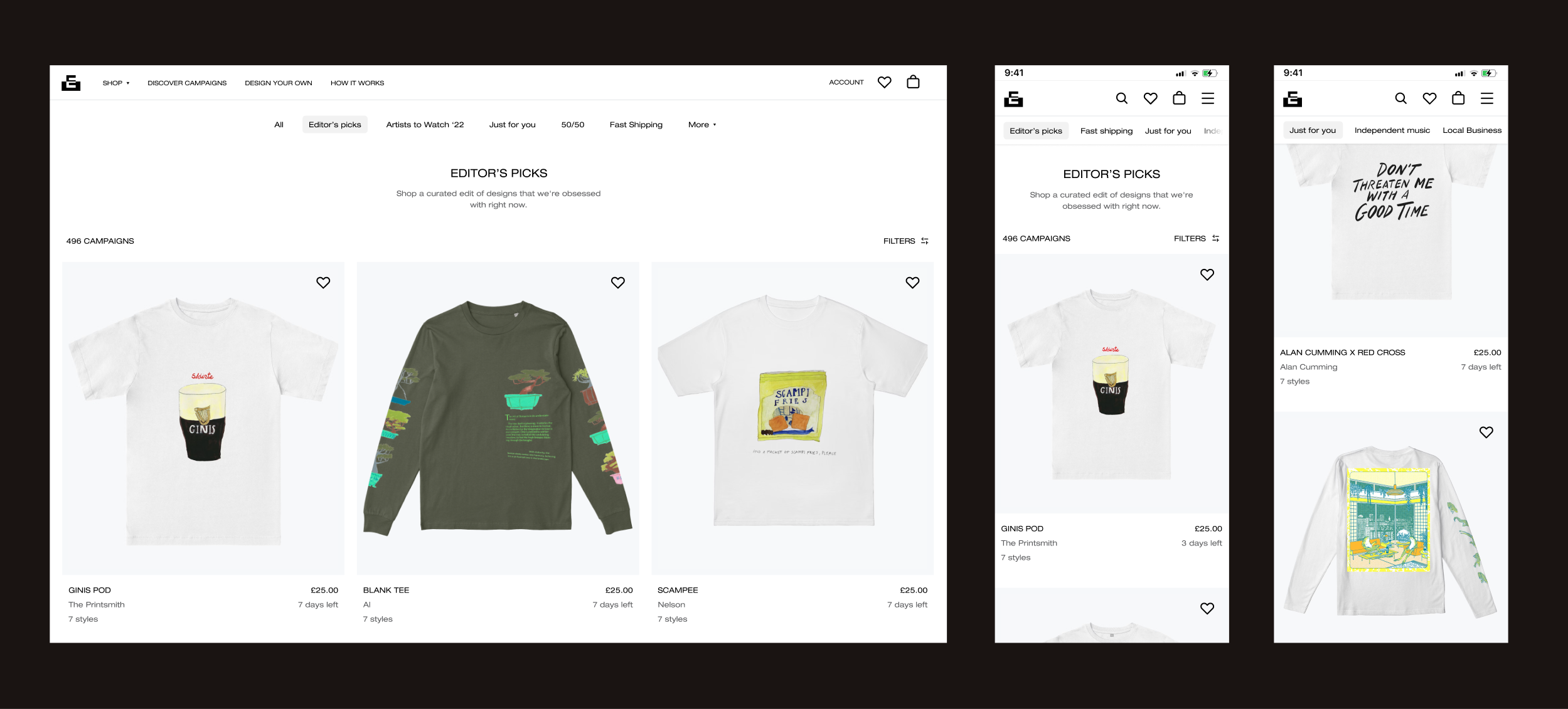
1) Category sub-navigation
When the user starts to scroll through a category page on Everpress, there are no further navigation options. We saw in Mixpanel data that users would often being scrolling on the main “editors picks” category, then leave the site. We explored different options for having a sticky sub-navigation and tested the version seen below.
Hypothesis
By adding a sticky sub navigation to allow users to switch categories on the main shopping page, they will find products more easily, leading to increased sales conversion.
Results
The test resulted in a slight increase in products viewed and a significant increase in categories explored but an overall neutral impact on conversion rate. Although neutral, this test paved the way for future tests as we could now experiment with adding different products to the sub categories now that traffic was increased to these areas.
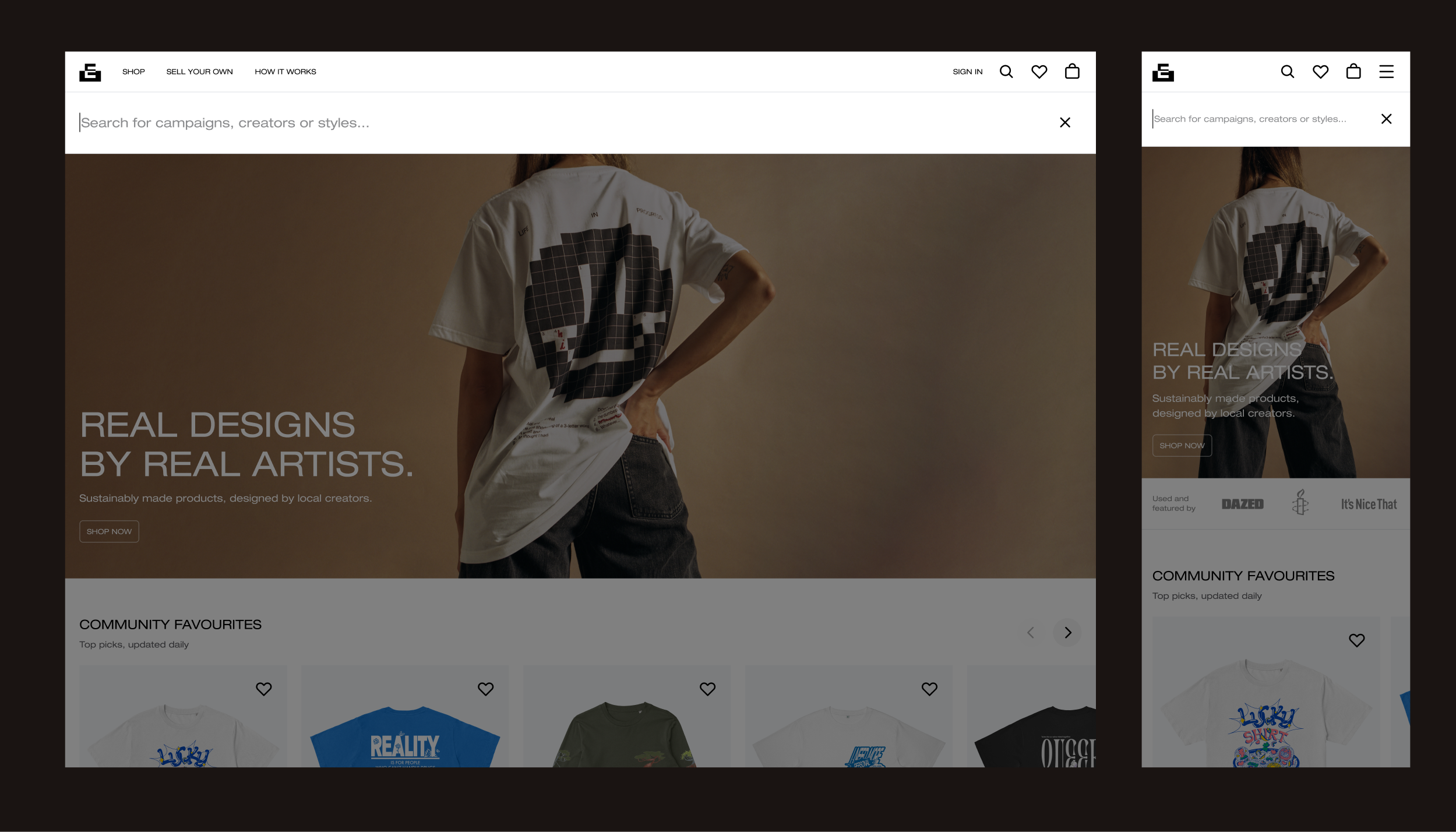
2) Global search
The previous search functionality just had a small search bar at the top of the product category pages. Once the user started scrolling, it was no longer visible. We thought that by making the search present at all times, we could increase discoverability.
Hypothesis
By moving the search bar into the fixed main navigation bar, it will be present at all times and increase its usage, leading to increased discoverability and sales conversion.
Results
The test resulted in a slight increase in products viewed and a significant increase in categories explored but an overall neutral impact on conversion rate. Although neutral, this test paved the way for future tests as we could now experiment with adding different products to the sub categories now that traffic was increased to these areas.
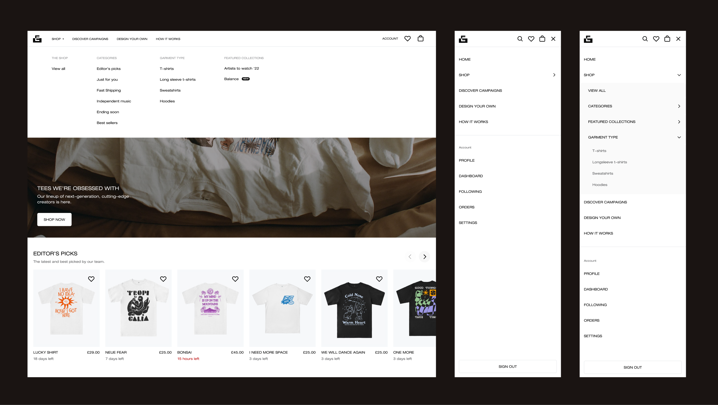
3) Mega menu & garment categories
We learnt from the research that users wished to be able to browse by garment type. The only way to do that previously was by applying garment filters in the filter sidebar. Mixpanel data showed us that few users were actually doing so, suggesting that this functionality was lost by many. We felt we could solve a user pain point and increase the discoverability of products by creating dedicated garment sub sections on the platform.
The site also lacked a simple, centralised way for users to access each area of the sitemap. The previous build had a little-used side scrolling menu on the main product category page to navigate, but most users didn’t use this and just began scrolling. We felt that by having a persistent menu that allows one to quickly reach any area of the site, we could greatly boost discoverability.
Hypothesis 1
By allowing users to explore individual garment types, e.g. T-shirts, Hoodies, etc., they will find desired products more easily, leading to increased sales conversion.
Hypothesis 2
By providing a way for users to drill down into any category from any point in the user journey, they will find products more easily, leading to increased sales conversion.
Results
The mega menu and garment types (launched together) resulted in a 10% increase in sales conversion. Significant traffic moved to the garments pages over the previously dominant Editors’ Picks page, suggesting these pages were the main contributor to the conversation rate spike. That said, the garments pages are only accessible from the mega menu so the test can be seen as a win on both fronts.
Conclusion
Through a combination of user research, data insights, and iterative A/B testing, we successfully identified and addressed key obstacles in Everpress' buyer journey. While initial tests on navigation enhancements and global search showed neutral impact on sales conversion, they played a crucial role in laying the groundwork for more impactful changes.
The introduction of a mega menu and garment-specific categories proved to be the most significant improvement, leading to a 10% increase in sales conversion. This demonstrated the importance of intuitive navigation and product discoverability in driving purchasing behavior.
Overall, this project highlights how a research-driven, iterative approach to UX optimization can lead to measurable business growth. By continuously refining the user experience, Everpress is now better positioned to convert browsing users into loyal customers.