Chemothermia are a Turkey-based Oncology clinic founded by two of the most renown Oncologists in the world - Prof. Bulent Berkada and Prof. Mehmet Salih Äyikesici. In 2018 I helped work on their branding and web design for Liquid Light
Despite boasting two of the worlds leading Oncologists, Chemothermia weren't seeing the levels of overseas patients they had expected.
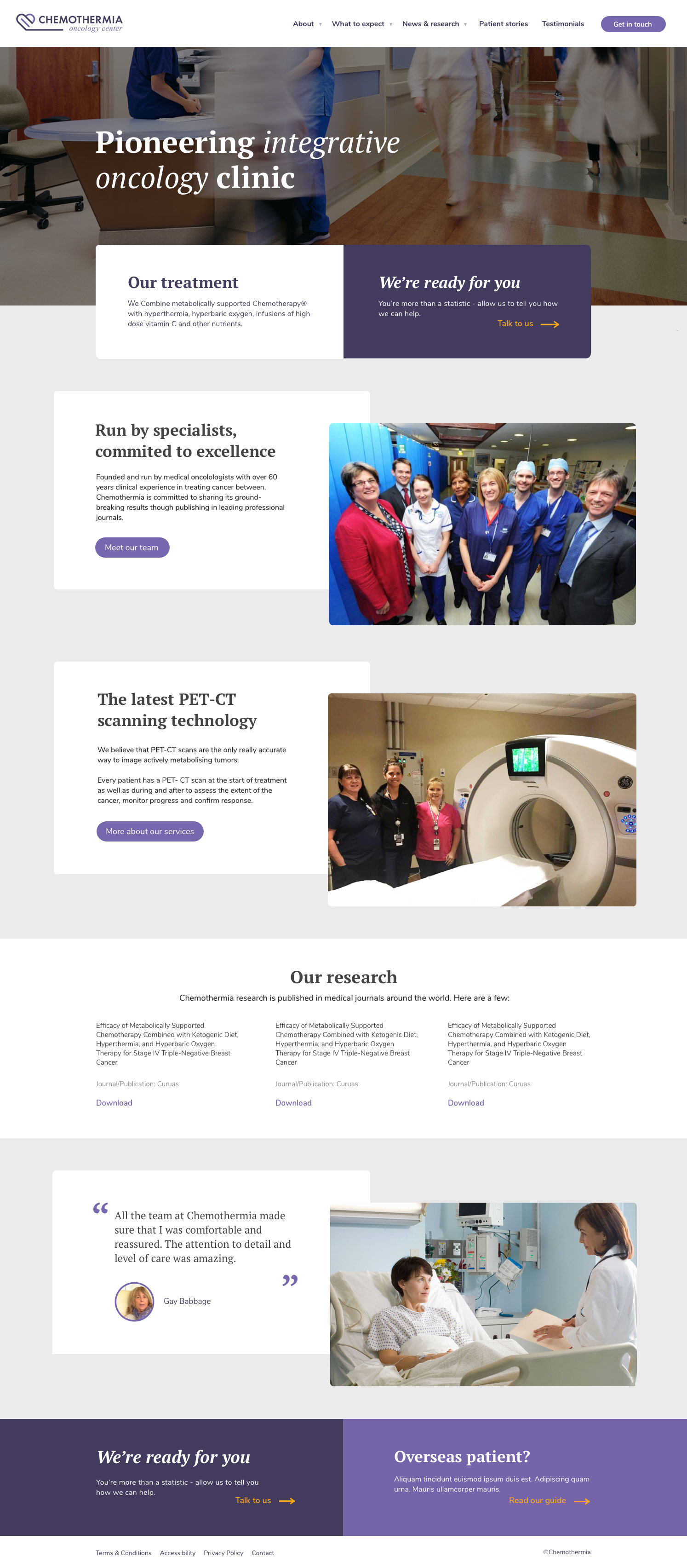
We refreshed Chemothermia's brand to convey a sense of trust and care and helped promote the benefits of finding care overseas through a new website design.
The existing was very outdated, which made it difficult for users to trust it. Conveying a feeling of trust is obviously extremely important when dealing with medical issues. This is especially true for a clinic based in Turkey where the vast majority of patients are from overseas. In part, this was due to inappropriate visual design choices that set the wrong tone, irrelevant news articles and untrustworthy-looking UI elements such as 3rd party contact forms.
Firstly we collaborated with Chemothermia to define positioning using a matrix of different tangents such as "Things are serious" vs "Don't worry everything is fine". By discussing where Chemothermia should sit on each of these tangents, we gained a clear direction for the website that would feed into its tone of voice and messaging as well as giving us the insight needed to explore what this meant visually.
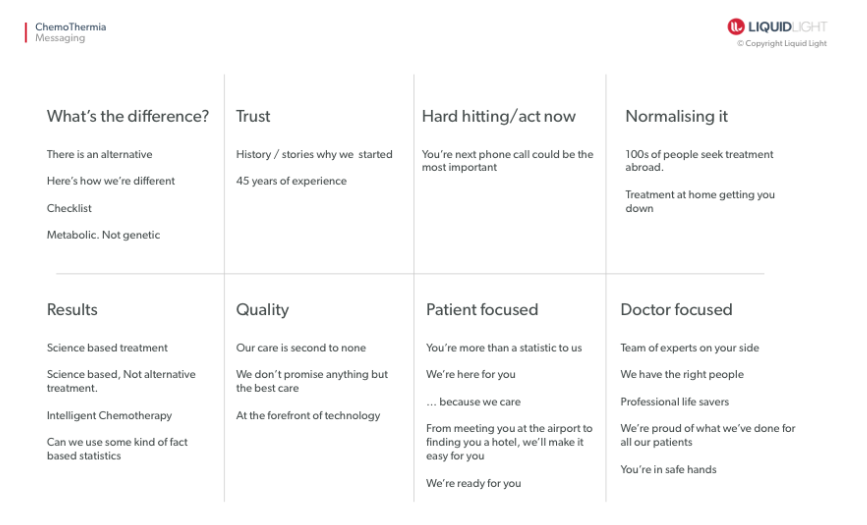
The next part of the branding process focused specifically on defining messaging and content strategy. To do this we created a grid displaying eight different messaging themes to discuss and build upon with the client. Although each theme was relevant, by concentrating on one or two we could we could push a core message without diluting it.
 Brand tone exploration
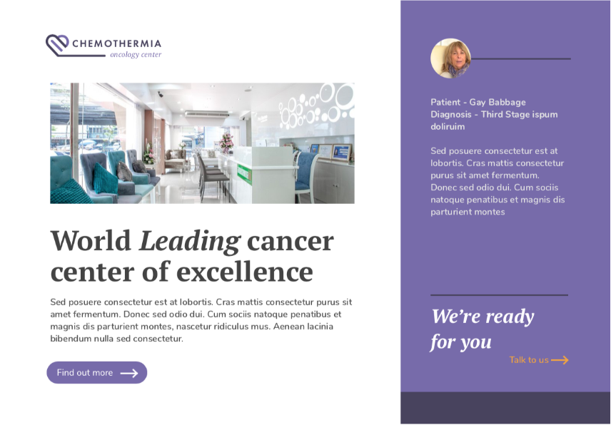
Style tiles are a deliverable that enables us to explore the look and feel before the more time-consuming key screen design phase begins. These include samples of imagery, UI (User interface) elements such as buttons & forms, as well as colour choices and messaging examples. The chosen style-tile can be seen below. The colour choice of light purple works well to provide a premium yet softer, approachable feel. We've balanced this with serif fonts, conveying a more formal and serious side.